Putting the 'role' back in role-playing games since 2002.
Donate to Codex
Good Old Games
  • Welcome to rpgcodex.net, a site dedicated to discussing computer based role-playing games in a free and open fashion. We're less strict than other forums, but please refer to the rules.

    "This message is awaiting moderator approval": All new users must pass through our moderation queue before they will be able to post normally. Until your account has "passed" your posts will only be visible to yourself (and moderators) until they are approved. Give us a week to get around to approving / deleting / ignoring your mundane opinion on crap before hassling us about it. Once you have passed the moderation period (think of it as a test), you will be able to post normally, just like all the other retards.

Game News Wasteland 2 Kickstarter Update #29: Inventory System Demo

Infinitron

I post news
Staff Member
Joined
Jan 28, 2011
Messages
97,506
Codex Year of the Donut Serpent in the Staglands Dead State Divinity: Original Sin Project: Eternity Torment: Tides of Numenera Wasteland 2 Shadorwun: Hong Kong Divinity: Original Sin 2 A Beautifully Desolate Campaign Pillars of Eternity 2: Deadfire Pathfinder: Kingmaker Pathfinder: Wrath I'm very into cock and ball torture I helped put crap in Monomyth
There's no reason to drop it, even if they wanted to make a grid it would take zero effort to offer a toggle between the two

Well, it's not quite that simple. A grid would require better artwork, and also a different way to display the statistics of each item (since you no longer have those handy columns showing weight, type, value)
 
Self-Ejected

Excidium

P. banal
Joined
Aug 14, 2009
Messages
13,696
Location
Third World
There's no reason to drop it, even if they wanted to make a grid it would take zero effort to offer a toggle between the two

Well, it's not quite that simple. A grid would require better artwork, and also a different way to display the statistics of each item (since you no longer have those handy columns showing weight, type, value)
I mean if they went ahead and made a grid anyway they could keep both.
 

UnknownBro

Savant
Joined
Mar 23, 2012
Messages
373
In the apocalyptic world of tomorrow you have to make inventory interfaces out of junk and decade-old monochrome monitors... :lol:

But bad design has no excuses!
 

janjetina

Arcane
Patron
Joined
Mar 28, 2008
Messages
14,231
Location
Zagreb, Croatia
Torment: Tides of Numenera
There's no reason to drop it, even if they wanted to make a grid it would take zero effort to offer a toggle between the two

Well, it's not quite that simple. A grid would require better artwork, and also a different way to display the statistics of each item (since you no longer have those handy columns showing weight, type, value)

Tooltips.
 

hiver

Guest
Or a small side "window" or just a bloody section, that would display all the info you need when you click on any icon.
 

Kahlis

Cipher
Joined
Jun 23, 2012
Messages
408
In the apocalyptic world of tomorrow you have to make inventory interfaces out of junk and decade-old monochrome monitors... :lol:
But bad design has no excuses!
Somebody has the time to take polaroids of all the random junk they find in the wasteland too. Have a real studio look to them. Does one of the rangers carry around a backdrop with him everywhere?
 

St. Toxic

Arcane
Joined
Jun 9, 2006
Messages
9,098
Location
Yemen / India
What they really should do is an Ultima style inventory.

38-U7_01_30.png
 

hiver

Guest
cSv4hqy.jpg


The screen with the character 3D model and the section with companion portraits go into the character screen. NOT into MY inventory.
 

hiver

Guest
look you brainded morons....
for fuck sake....


this is just a rough example of the concept, done in the quickest way.
not the actual ending version of how it all should look.

a fucking paper doll section and the grid and icons of items?
while the stupid and unnecessary parts are moved away so you can have more then enough space for all the info, stats and whatever else should be shown in the fucking inventory screen.

pay attention to the fact that there are still tabs over items in inventory, there are still favorites - and that you could scroll the bloody list if necessary.
 

FeelTheRads

Arcane
Joined
Apr 18, 2008
Messages
13,716
this is just a rough example of the concept

It's a rough turd of a shit.
Like when you can't shit for a while and your shit hardens in your asshole but then you do and it comes out and there's soft shit following it too? That's what this is.

not the actual ending version of how it all should look.

How about posting what you want, instead of slamming your face in the keyboard cuz zomg people don't understand IT"S NOT FINAL JUS TWAIT TILL INZILE HIRES ME TO SEE FINAL K??
 

St. Toxic

Arcane
Joined
Jun 9, 2006
Messages
9,098
Location
Yemen / India
It's missing the option of switching between characters in inventory, but I guess you could bypass that by shrinking the inv to the smallest possible size and keeping the gameworld gui accessable. It would still work, though at this point having item descriptions in inventory would be redundant when you can just display the text in the gameworld console.

Also, I think it's commendable for anyone to try their hand at improving the inventory design, no matter what the approach, rather than just riding inX's take or shrugging in apathy.
 

hiver

Guest
this is just a rough example of the concept

It's a rough turd of a shit.
Like when you can't shit for a while and your shit hardens in your asshole but then you do and it comes out and there's soft shit following it too? That's what this is.
Yes. You moron.
Because its a crude example done in five minutes.

ITS AN EXAMPLE YOU MORON.

DONT YOU FUCKING KNOW WHAT THE WORD EXAMPLE MEANS YOU RETARD?

How about posting what you want, instead of slamming your face in the keyboard cuz zomg people don't understand IT"S NOT FINAL JUS TWAIT TILL INZILE HIRES ME TO SEE FINAL K??
Rads, you stupid cheap moron... - I dont have any fucking reason to waste time and create the whole interface, with all the graphikz details you stupid cheap bitches here like so much.

Im not going to do any fucking border lines, and im not going to do any sections where the text should go. Nor am i going to draw my own icons of all items or the grid or the paper doll section, you imbecile.
Im not going to do it for InXile and im not going to do it for you stupid scum and your pathetic, idiotic approval.

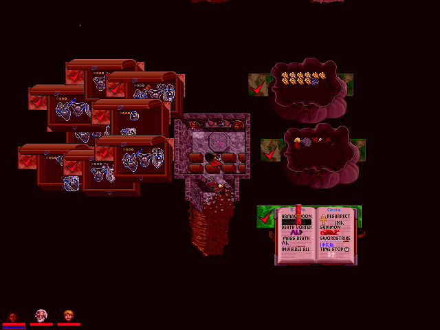
THIS just shows how much space you can get if you remove the parts that are not suppose to be there in the first place.
As ive been saying from the start. The fucking INVENTORY only needs to show the "paper doll" section and the items in the grid.
Thats it. Nothing else needs to be shown in this particular window.
That is what i want and that is what i made, you pathetic dumbfucking imbecile.

Therefore i just used parts of stalker inventory, copy - cut - pasted to show how things could possibly look like... if someone would create and use good looking icons of items, instead that horrible one colored crap InXile uses that looks almost exactly like Facepalm3 icons.

and yes, your brain is obviously consumed by your burning desire to cause some butthurt - because you are butthurt.
Which makes you a blatant moron.
And then you just repeat it all over again, desperately hoping that this time it will work and you will come out on some "top".


It's missing the option of switching between characters in inventory, but I guess you could bypass that by shrinking the inv to the smallest possible size and keeping the gameworld gui accessable. It would still work, though at this point having item descriptions in inventory would be redundant when you can just display the text in the gameworld console.

No, the characters portraits go into the character screen. The inventory can show all the items that the whole company has, separated by tabs. Small tabs.
Alternatively the companions can get their own tabs, here in the main inventory screen, with just their names or even a small pic so a player can click on them and see only the items they have in their own inventories, but there is no actual sane reason for them to be in that big strip in the inventory screen itself.

It would still work, though at this point having item descriptions in inventory would be redundant when you can just display the text in the gameworld console.
Dont you want to check and compare stats and all other info that might be relevant while you are browsing your inventory?
Are you going to equip something without knowing what it is and then go into the game and check what the fuck you HAVE - in the game, or is it more efficient and quicker to do it in the inventory itself??
 

hiver

Guest
hiver said:
delicious butthurt

Sorry, bro, wasn't talking about how it looks, but the layout. That's shit too.
Explain how the "layout" is shit there too.

But do it in a way that doesnt mention or is not related to the looks of it.

look you brainded morons....
Why is your first assumption always that everyone else is mentally deficient?
Why is your assumption that im assuming "everyone else"?
 

As an Amazon Associate, rpgcodex.net earns from qualifying purchases.
Back
Top Bottom