Kaucukovnik
Cipher
- Joined
- Mar 26, 2009
- Messages
- 488
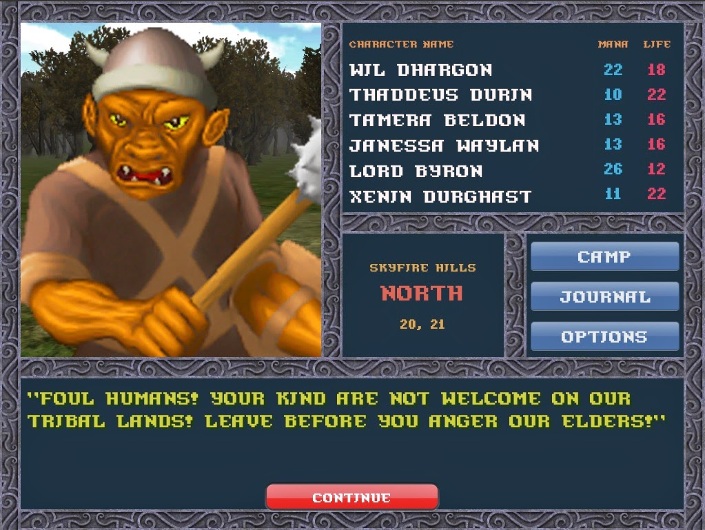
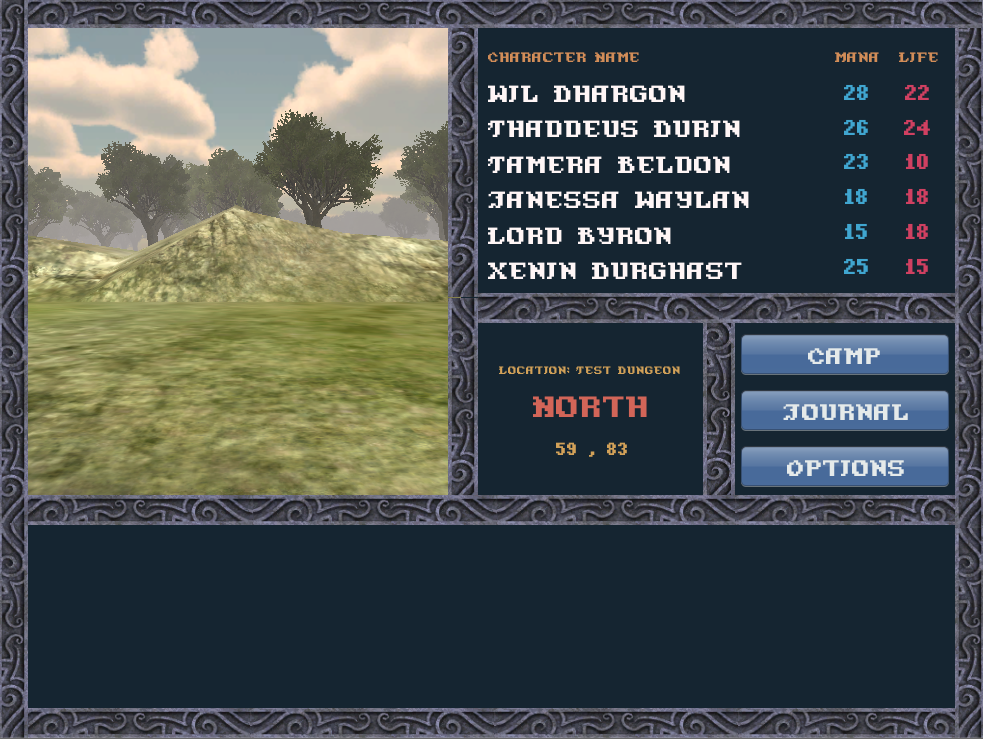
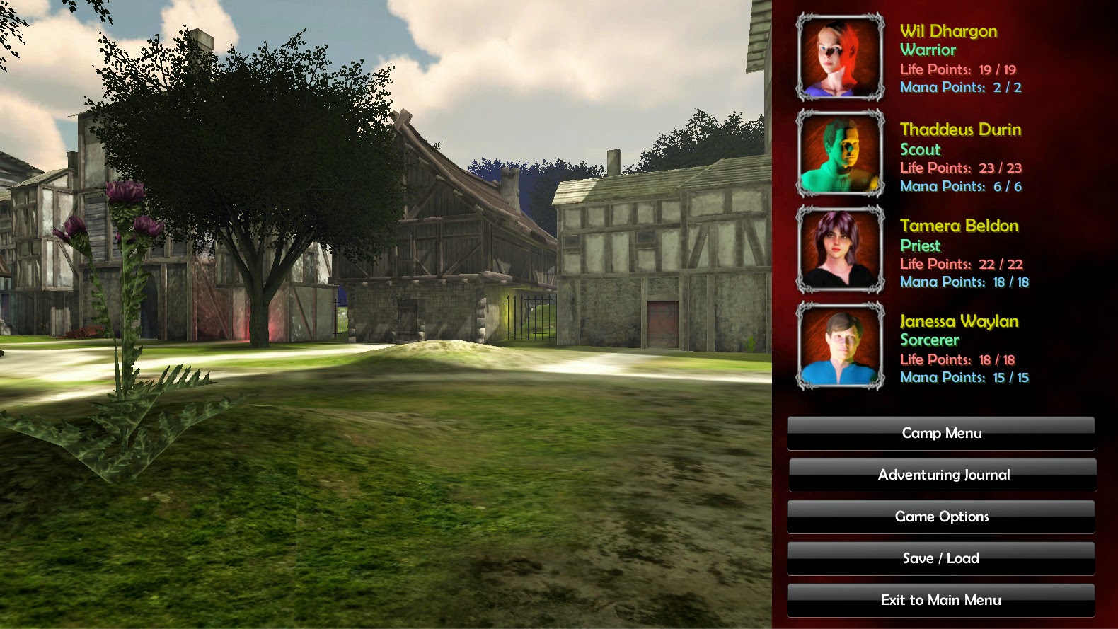
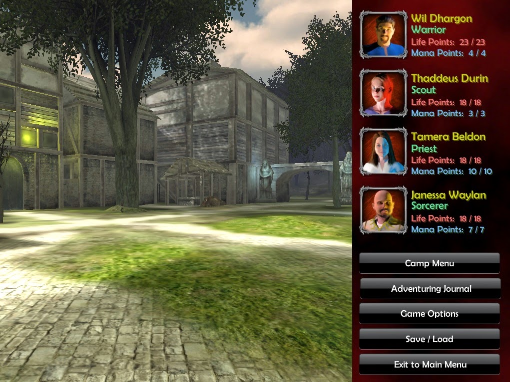
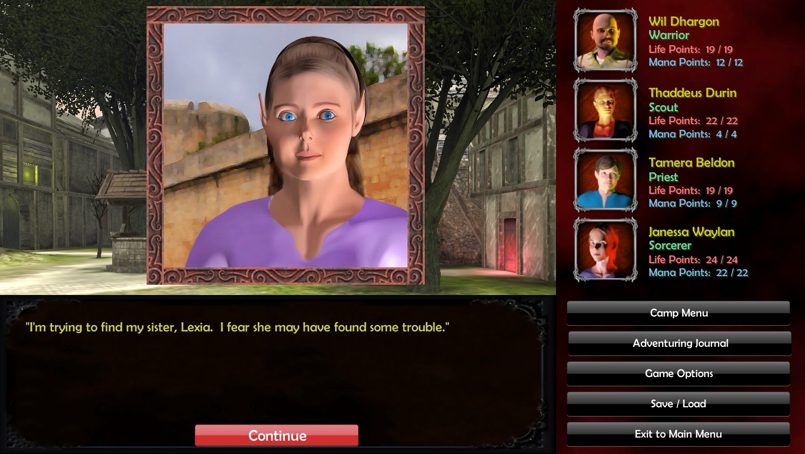
Too many styles clash in the last two images. 3D rendered viewport, detailed carved borders, pixellated retro font and "web 2.0 style" buttons (these are just placeholders, I guess).
The previous, curvy font was better in this regard. Readability is another thing, of course.
The previous, curvy font was better in this regard. Readability is another thing, of course.