Putting the 'role' back in role-playing games since 2002.
Donate to Codex
Good Old Games
  • Welcome to rpgcodex.net, a site dedicated to discussing computer based role-playing games in a free and open fashion. We're less strict than other forums, but please refer to the rules.

    "This message is awaiting moderator approval": All new users must pass through our moderation queue before they will be able to post normally. Until your account has "passed" your posts will only be visible to yourself (and moderators) until they are approved. Give us a week to get around to approving / deleting / ignoring your mundane opinion on crap before hassling us about it. Once you have passed the moderation period (think of it as a test), you will be able to post normally, just like all the other retards.

Lands of Adventure: A Gold-Box Inspired CRPG

Grunker

RPG Codex Ghost
Patron
Joined
Oct 19, 2009
Messages
27,423
Location
Copenhagen
If that's what gets your game out the door, it is 100% the correct decision and I think you are wise in making it.

However, isn't documenting the OGL basically a matter of copy-pasting text from www.d20srd.com?
 

ProphetSword

Arcane
Developer
Joined
Jun 7, 2012
Messages
1,755
Location
Monkey Island
It could be. But there were other considerations as well. I appreciate the feedback I got from everyone, but it really will be easier to build a system to work with the game (which I've already done) rather than trying to shoehorn an established system into it.
 

Alchemist

Arcane
Joined
Jun 3, 2013
Messages
1,439
If anyone is interested in seeing what has happened to the game, feel free to check out my development blog:

http://landsadventure.blogspot.com/

I just posted some new screenshots and some explanation of what is going on with the game.
Looking good, man. I for one am liking the "goldbox" direction this is going in now. I think there will be quite a few people here who would love to see a goldbox-style game.

What UI system did you end up using to get that dynamic screen size scaling working? That's something I'll need to tackle in my game at some point.
 

ProphetSword

Arcane
Developer
Joined
Jun 7, 2012
Messages
1,755
Location
Monkey Island
I'm using the lite version of iGUI, which costs around $35 or $40 for those who are on a budget.

EDIT:
Apparently, the price has dropped since I bought it. And I got the name wrong. It's actually called "iGUI Basic" and it's currently around $15. If you're looking for a cheap GUI system that's similar to the one in Visual Studio, I recommend it.
 
Last edited:

Dorateen

Arcane
Joined
Aug 30, 2012
Messages
4,371
Location
The Crystal Mist Mountains
Read the blog update, and I like the move in this direction. First person exploration looks good, and the narrative screens such as with the goblins, is great. Glad to see you sticking with your original vision for the game.
 

mondblut

Arcane
Joined
Aug 10, 2005
Messages
22,253
Location
Ingrija
"characters will be pretty straightforward in the same way that they were in any of the Gold-Box titles"

Technically, if we count Buck Rogers games, this isn't true. Buck Rogers had a fuckton of skills.

There is a lot of wasted screenspace with all these monochrome frames etc. Just because SSI couldn't do better in 320x200 age doesn't mean you are ought to have separate screens for stats, spells or equipment when they could easily fit in together. Or omit stuff like character portraits on main GUI in favor of thumb-thick frames just because POR wasn't physically able to fit them in.
 

ProphetSword

Arcane
Developer
Joined
Jun 7, 2012
Messages
1,755
Location
Monkey Island
Character portraits were removed to make room for six characters. You only see wasted screen space because of the resolution. In much lower resolutions, there is far less space.
 

Durwyn

Prophet
Joined
Oct 29, 2006
Messages
1,132
Location
Erewhon
"characters will be pretty straightforward in the same way that they were in any of the Gold-Box titles"
:hmmm:

Too bad about it, but still good luck mate in pursuing your vision.
 

Durwyn

Prophet
Joined
Oct 29, 2006
Messages
1,132
Location
Erewhon
I like my complexity and depth in character building, until 3rd D&D edition I wasn't really satisfied. Should wait for some more details on RPG system I suppose.

"Which D&D ed is the best and why it is Pathfinder" shitstorm approaching.
 
Last edited:

ProphetSword

Arcane
Developer
Joined
Jun 7, 2012
Messages
1,755
Location
Monkey Island
As I stated on my blog, if you like deep character building, this is not the game for you. This game is focused on other RPG aspects. Sorry. I recognize that some people enjoy that aspect of RPG games. Sometimes, I even enjoy it myself. But, it's not the vision I have for this game. Thanks for the feedback.
 
Last edited:

mondblut

Arcane
Joined
Aug 10, 2005
Messages
22,253
Location
Ingrija
Character portraits were removed to make room for six characters. You only see wasted screen space because of the resolution. In much lower resolutions, there is far less space.

Look, you'd be hard-pressed to find a bigger Goldbox fanboy than I am, but rigidly aping their screen layout when you have 9 times their screen space at your lowest resolution is a bad idea. Really. Having a party of 6 to 8, step-based first person movement and overhead tactical combat with significant amount of movement points on large, obstacle-heavy battlemaps repeating the dungeon layout - this is perfectly sufficient to be a Goldbox-tribute game. Having six names and 12 pairs of digits occupy 20% of the screen, and a message field which is blank 98% of time occupy another 1/3 of it is completely unnecessary for that. Regardless of free movement or blobber combat, the Basic Fantasy-period layout was far superior.
 

ProphetSword

Arcane
Developer
Joined
Jun 7, 2012
Messages
1,755
Location
Monkey Island
Character portraits were removed to make room for six characters. You only see wasted screen space because of the resolution. In much lower resolutions, there is far less space.

Look, you'd be hard-pressed to find a bigger Goldbox fanboy than I am, but rigidly aping their screen layout when you have 9 times their screen space at your lowest resolution is a bad idea. Really. Having a party of 6 to 8, step-based first person movement and overhead tactical combat with significant amount of movement points on large, obstacle-heavy battlemaps repeating the dungeon layout - this is perfectly sufficient to be a Goldbox-tribute game. Having six names and 12 pairs of digits occupy 20% of the screen, and a message field which is blank 98% of time occupy another 1/3 of it is completely unnecessary for that. Regardless of free movement or blobber combat, the Basic Fantasy-period layout was far superior.


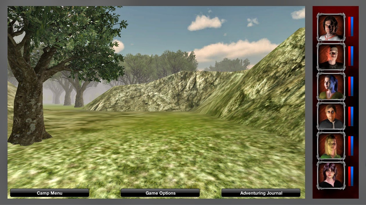
It took me a couple of days of letting it sink in, but I think you're right. I suppose I can still write a "Gold-Box" inspired game without being married to the screen format of those games. So, here is an idea I'm working with. It's a minimal approach, allowing the 3D viewport the most space on the screen. It's a work in progress, but I do want to hear feedback about it.

NewScreen.jpg
 

Dorateen

Arcane
Joined
Aug 30, 2012
Messages
4,371
Location
The Crystal Mist Mountains
heh... I kind of liked the names and numbers only. But the portraits along the side look good. Even Underworld has gone from character names and bars to portraits. I think the first cRPG I played that used portraits/pictures was Tunnels & Trolls.

I do prefer exploration in first person, one of the reasons I'm looking forward to this project.
 

ProphetSword

Arcane
Developer
Joined
Jun 7, 2012
Messages
1,755
Location
Monkey Island
Thanks for the feedback, Dorateen.

I'm not 100% sold on the health/mana bars versus having the actual stats as numbers. Anyone have any thoughts about that.
 

mondblut

Arcane
Joined
Aug 10, 2005
Messages
22,253
Location
Ingrija
Thanks for the feedback, Dorateen.

I'm not 100% sold on the health/mana bars versus having the actual stats as numbers. Anyone have any thoughts about that.

You can always have both, like EOB and a bunch of other games giving an option to switch between numerical and bar presentation of hit points. Or combine for tiny numbers on top of the bars.

You could use spare screenspace for an oldschool GUI block, the minimap (pls no AREA/VIEW switch, lol), compass, action buttons etc. Then again, map can just hang alone in, say, upper left corner, and basic NSEW compass widget at middle top edge. The bottom can be used for the row of buttons with standart actions GB-style - camp, search, cast, what have you (better as a solid block than a bunch of disconnected buttons). With this resolution, you could probably fit them all at once without the submenus :) Or make them pop up on hover the www-style. As for message panel, you could either do independent popup windows like Realms of Arkania, or have a fixed text console which pops up at the bottom of the screen when there is something to tell (and either disappears when there is no text to show, or is permanent but can be minimized by player).
 

mondblut

Arcane
Joined
Aug 10, 2005
Messages
22,253
Location
Ingrija
You could use spare screenspace for an oldschool GUI block, the minimap (pls no AREA/VIEW switch, lol), compass, action buttons etc. Then again, map can just hang alone in, say, upper left corner, and basic NSEW compass widget at middle top edge. The bottom can be used for the row of buttons with standart actions GB-style - camp, search, cast, what have you (better as a solid block than a bunch of disconnected buttons). With this resolution, you could probably fit them all at once without the submenus :) Or make them pop up on hover the www-style. As for message panel, you could either do independent popup windows like Realms of Arkania, or have a fixed text console which pops up at the bottom of the screen when there is something to tell (and either disappears when there is no text to show, or is permanent but can be minimized by player).

Sorta kinda:

1XpndvQ.jpg
 
Joined
Aug 25, 2012
Messages
181
Can't say that I agree with all of you championing for minimal interfaces. There is a difference between designing a game UI and, e.g., a car HUD; + genre differences should be taken into account as well (don't treat every FPRPG like an FPS - different playstyle, different user requirements).

This is the second time (first one was Underworld Sovereign) that a game has ended up with a significantly more bland and ugly interface after Codexer's recommendations. Form over function can be a valid paradigm for game UI design, especially when designing an RPG in which (a) you want to preserve a nostalgic feel, (b) can design the game more easily around a limited viewport or other obstructions (as opposed to, let's say, an FPS). And an (artistically) well-done interface can enhance atmosphere and give you that special feel of "Yeah, I'm playing x right now, not Skyrim-knockoff N.34" and not make you feel like trudging through bland 3D-terrain all the time.

The big advantage of modular minimalistic interfaces is, of course, easy scalability, which shouldn't be sacrificed easily in this day and age. But I'd say there are still convincing arguments to be made for (relatively) old-school interfaces. Bottom line: The screenshot from your blog post made me really eager to give your game a try, the last two ones ... not so much.
 

ProphetSword

Arcane
Developer
Joined
Jun 7, 2012
Messages
1,755
Location
Monkey Island
I understand your frustration. At the same time, I can see the value in a streamlined interface.

Here's the important thing to remember: The gameplay is far more important than the interface. Anyone who plays a game simply for the way it looks is bound to be disappointed.

This is partially my own fault, anyway. I probably shouldn't have revealed anything until I had more to show. Every time I do, the whole project gets sidetracked by helpful folks who think the UI should be changed or that the artwork is wrong or that there should be more classes or whatever. This game will never be what everyone wants it to be. And if I keep allowing myself to get distracted in this way, it'll probably never get done. My first version was about 80% done when I first revealed it, and the feedback on that is what got me to restart the project in Unity. I don't regret it, but I still have to wonder where I'd be if I'd just finished it and started a second project instead of doing this one for the fifth time.

So, yeah, I get what you're saying. I'm going to have to consider how I want to approach things.
 

Alchemist

Arcane
Joined
Jun 3, 2013
Messages
1,439
I think mondblut's initial point is valid, in that more of the screen space could be used for useful things such as character portraits (which I always like to see, by the way). But that doesn't mean you need to go to the modern, minimal HUD route. That kind of takes away some of the flavor of a classic-style game. You could still have a retro-style UI with inset game view and lots of information in the UI frame elements (including the portraits, command buttons, flavor text area, etc.). With the high screen resolutions of today compared to the old Gold Box days, you could really fit a lot of info into that frame. That depends on how much you want to show at one time though.

I definitely like having the health / mana bars include the number readout, with an option to toggle.
 
Last edited:

dragonbait

Augur
Joined
Jul 4, 2009
Messages
290
Location
Below the ruins of Yulash
I prefer the gold box style layout with text names and stats shown rather than baldur's gate-ish portraits squeezed to the right to make way for more 1st person view, although I realize that makes the 1st person view much smaller in size so I understand how others prefer the newer Baldur's Gat-ish style. I've just never really liked having portraits of all characters on the main screen at the same time while traveling through the game having the characters mugs staring at me the whole time. IMO the bard's tale layout with text+stats on the main screen with portraits only shown when you selected to view a character was the best. They even had animated portraits on the character screen. Regarding the health+mana bars I prefer stats rather than bars or at least an option to toggle between the two styles (text versus bars) like the Eye of the beholder games had. Just my 2 cents.
 

As an Amazon Associate, rpgcodex.net earns from qualifying purchases.
Back
Top Bottom