-
Welcome to rpgcodex.net, a site dedicated to discussing computer based role-playing games in a free and open fashion. We're less strict than other forums, but please refer to the rules.
"This message is awaiting moderator approval": All new users must pass through our moderation queue before they will be able to post normally. Until your account has "passed" your posts will only be visible to yourself (and moderators) until they are approved. Give us a week to get around to approving / deleting / ignoring your mundane opinion on crap before hassling us about it. Once you have passed the moderation period (think of it as a test), you will be able to post normally, just like all the other retards.
You are using an out of date browser. It may not display this or other websites correctly.
You should upgrade or use an alternative browser.
You should upgrade or use an alternative browser.
Pretti! Interface-graphics
- Thread starter Fresh
- Start date
Elhoim
Iron Tower Studio

- Joined
- Jan 4, 2005
- Messages
- 24,793


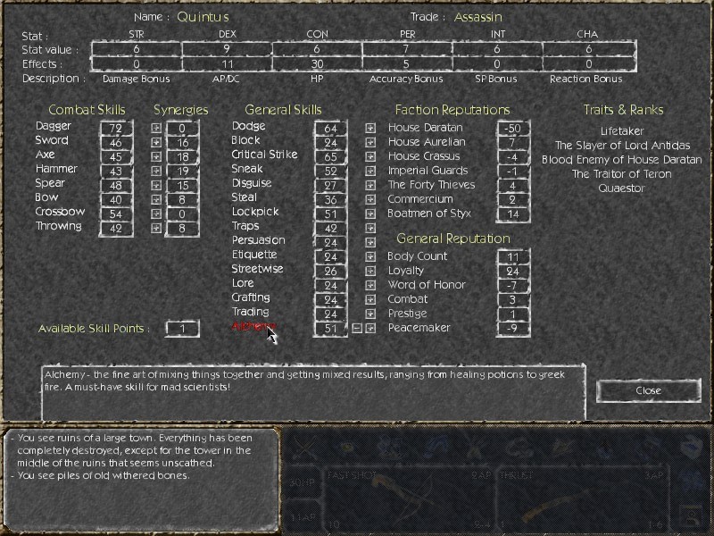
Worse than the original. The font is incompatible with the background, and too bright. Maybe if the background was darker you could use pure white, but not right now. Also, maybe you should consider using a different font in general.
Edit: After looking at both old and new at once I would reconsider and say that this is about 5% better, but not quite eye-friendly. But then again, I do think this is a personal matter of taste.
Edit: After looking at both old and new at once I would reconsider and say that this is about 5% better, but not quite eye-friendly. But then again, I do think this is a personal matter of taste.
Elhoim
Iron Tower Studio

Can't say I like it. The wooden background is too similar to the wooden floor in the gameworld. The UI shouldn't blend in with the gameworld like that. It looks like the UI is camouflaged.
Also, the borders don't mesh with the background, and while the shadows on the icons are a nice touch, I feel that stylistically the icons don't fit with the background.
The new UI doesn't look like an entity, it looks like random elements thrown together.
I'd just like to see the icon shadows on the original UI.
spacemoose
Erudite
seconding. that ui looks great, Elhoim. one suggestion - make the icons monotone, then they will stand out more.
Sovy Kurosei
Erudite
- Joined
- Dec 29, 2004
- Messages
- 1,535
This is the GUI I showed off a while back.


spacemoose
Erudite
Sovy Kurosei said:This is the GUI I showed off a while back.
while nicer than the original, that looks more suited to Age of Decadence II: Colony Ship
Severian Silk
Guest
spacemoose
Erudite
that looks pretty fancy, but it needs some kind of border between the 'world screen' and the interface.
Mantra_n
Novice
ok how about this? icons still need work, and sorry about the diablo font lol didn't have anything else that fit the theme.


spacemoose
Erudite
TREMENDOUS WIN that looks very professional. it is so good in fact that I have a sneaking suspicion that you nabbed that from some existing game
only thing I would chage is the font - too diablo-ey
only thing I would chage is the font - too diablo-ey
Mantra_n
Novice
yeah i like the existing font they got in aod, and no lol this isn't from any existing game this is all just made in ps with some free textures and a little bit of time.
Jim Kata
Arbiter
Yeahm I like this last one a lot. the second wood is good, too - I realize now the lame font is a lot of the problem with the original. Looks far too modern. The diablo font is a bit much, but it is still better than the old one by far.
Sovy Kurosei
Erudite
- Joined
- Dec 29, 2004
- Messages
- 1,535
Wow, nice job Mantra. I really like that.
Hm,
I guess looking at the wooden one (which I suspect might have a very different effect in a different scene of the game - one without wooden floors) and the second one (which rocks hard, not considering the diablo font) VD would have to notice that using one of those suggestions would indeed be valuable to the game.
right?
Elwro
Arcane
So, isn't it obvious there should be a 600 MB bonus interface pack available for download for registered users of the game?
BTW, Mantra - good job! I especially like the icons.
BTW, Mantra - good job! I especially like the icons.
MountainWest
Scholar
Having looked at them I have to say:
Original: Too clean and too bright.
Elhoim: Better, but still to clean. I don't get a post-apoc-vibe from it. It's too "happy".
Mantra_N: This one I loved at first glance. Then it started to bug me. I don't like the transition between the gameworld and the interface. It doesn't fit. What about using something like that game on the first page with green, cracked marble or whatever it is (the last suggestion)? Not cracked marble, but perhaps crumbling stone or something. Could be just me though.
Then the glowing icons started to annoy me. They're too magicky. They remind me of something, but I can't remember what. Anyhow, I don't get an post-apoc-vibe from them.
I do like how the crossbow almost crumbles into to the background.
Elhoim
Iron Tower Studio

It´s funny that it ended looking like wood, as it is darkened marble.
Mantra´s one looks very good! Mine was only a small retexture with small changes. I see if I can do a complete overhaul!
What do you think it would be a good theme? I might go the roman columns way...
Mantra´s one looks very good! Mine was only a small retexture with small changes. I see if I can do a complete overhaul!
What do you think it would be a good theme? I might go the roman columns way...


