Putting the 'role' back in role-playing games since 2002.
Donate to Codex
Good Old Games
  • Welcome to rpgcodex.net, a site dedicated to discussing computer based role-playing games in a free and open fashion. We're less strict than other forums, but please refer to the rules.

    "This message is awaiting moderator approval": All new users must pass through our moderation queue before they will be able to post normally. Until your account has "passed" your posts will only be visible to yourself (and moderators) until they are approved. Give us a week to get around to approving / deleting / ignoring your mundane opinion on crap before hassling us about it. Once you have passed the moderation period (think of it as a test), you will be able to post normally, just like all the other retards.

GAMMA ZONE

Latro

Arcane
Joined
Jun 5, 2013
Messages
7,354
Location
Vita umbratilis
yeah thats obvious, i mean gameplay
There’s actually not that many rpgs that use the elminage gothic row style, Cleve could do the old style SMT stuff where they use guns that hit rows in specific ways with different ammo types
 

King Crispy

Too bad I have no queen.
Patron
Staff Member
Joined
Feb 16, 2008
Messages
1,876,699
Location
Future Wasteland
Strap Yourselves In
gzmenu.jpg
Looks very cool. Yes, button fonts need improvement; would be nice to see the font that you do choose "aged" a little to look like the words are baked onto the button surfaces.
 

Cleveland Mark Blakemore

Golden Era Games
Übermensch Developer
Joined
Apr 22, 2008
Messages
11,579
Location
LAND OF THE FREE & HOME OF THE BRAVE
yeah thats obvious, i mean gameplay
There’s actually not that many rpgs that use the elminage gothic row style, Cleve could do the old style SMT stuff where they use guns that hit rows in specific ways with different ammo types
I have been trying a lot of arrangements today and no way you slice it is the Eliminage Gothic portraits on the bottom a good layout. Far better to go with Wizardry Style rows and introduce that into the combat as ranged attacks, etc. Luckily I kept the little code snippet from Vault of Terror that lays them out left and right alternated. Those portraits were getting way too frilly, trying to keep this one with just the basic info.

I have been working my whole Saturday sorting the Character Plates out. The portraits flicker with scanlines like they are really on a monitor. Trying to keep it simple but elegant. Likely to put some masks over both the portrait and items to put them behind glass and keep the edge of the frame curved and a little faded. That big open space is reserved for buffs/debuffs/condition markers but it looks empty until something is there so may put an empty frame there to hold all that.

Told you those portraits I finally found were perfect. They're exactly what I wanted, somewhere between wild steampunk sci-fi and post-apoc. The ones I showed in early shots of GAMMA ZONE were okay but too cartoony so I am saving those for another game. Half the artwork in the game is from A-Ravlik and it looks smashing, especially because it is all identical art style and similarly themed. I really want the game to be a bit anime-style wild and not grimdark or too muted, that's the way I remember games like GAMMA WORLD that inspired it.

pcplates.jpg
 
Last edited:

Cleveland Mark Blakemore

Golden Era Games
Übermensch Developer
Joined
Apr 22, 2008
Messages
11,579
Location
LAND OF THE FREE & HOME OF THE BRAVE
What do you think of a layout with 4 characters at top? Combatants appear in the middle, classic scrolling text box at the bottom for narration and combat reports. It would be a little offbeat but I think I could also adjust the focal point in the 3D environments to make sure that's nothing much behind the portraits at top.

I added the TV screen over top of the portraits but I have to work on the scanline effect a little more. Looks like screen glitching at present but I'd rather have a real grainy 8-bit arcade scanline running down the portrait constantly.

I have an awesome blood shader effect on the portraits when they take damage, progressively fills up the window with blood spatters.

Most UI elements look better to me if I put a shadow offset under them but others might disagree. I think it looks good in a game which is highly stylized. It isn't trying to be DOOM, it's something totally different. It costs next to nothing to render.

That blank space to the right now is on the end, looks less weird. That's where up to four conditions/buffs appear at a time, plus a level up notifier you press to go to the character screen. Instead of stacking them on each other like in Grimoire, this gives you a good glance at anything currently active including priority conditions like burning, poisoned, diseased etc.

P.S. Just looking over the structure of the Worldmap and the linked areas, I noticed the game could really benefit from a mechanism similar to Fallout 1 where you can exit a world but return later and choose a level to return to. I just tried an experiment using a few simple icons and menu selections plus background and it was really effective. Like in the original Wizardry, it's good to be able to bail out at certain places and return to town to rest/heal/resupply/rearm and maybe replace party members who have been killed. I don't think there will be resurrection in this game, amongst other reasons it make the game harder and tougher to complete with limited saves and permadeath. If the party leader is killed, (CRACKERJACK here) then it's game over but you should be able to exit and come back with new people added to your squad.

P.P.S. Whoa I just realized I could have combat orders menu, character review and inventory and perks all appear below the character plates and it would be a very good way to organize the UI for the entire game in-play. I could still have the equip figure on a dialog window of its own but I have the Equip working from the inventory at present and it looks good. This would also allow the character figure room for those damage dials I demoed in a very early screen shot a long time back.

P.P.P.S. I don't want to screenshot the interfaces yet because they are so bland and boring and basically using placeholder graphics. I was just thinking, what about the character plate solid but all related interfaces done with translucent shaded backgrounds and green computer terminal text underneath exactly like Fallout PIPBoy display? That might look pretty awesome and when anything was pulled down during combat, you could always see the combatants there still. Eliminage Gothic has many translucent dialogs for the same reason. I could definitely get a video scanline on the interface going to make it look really retro.

gzSampleLayout.jpg
 
Last edited:

Cleveland Mark Blakemore

Golden Era Games
Übermensch Developer
Joined
Apr 22, 2008
Messages
11,579
Location
LAND OF THE FREE & HOME OF THE BRAVE
What do you think of a layout with 4 characters at top?

they are too big and take up too much space imo

cluster of smaller portraits in the upper left corner is better to me
Who about the portraits along the bottom and the combat text window centered at the top? Been experimenting with this all day long. This leaves lots of space with the combatants appearing above them, plenty of size in the viewport for them. I also have free look working in the blobber with right mouse button so you can examine things on the floor in front of you if they are obstructed by the portraits. Most of the 3D faux environs I have built so far have nothing significant to interact with lying flush with the floor as Grimoire does with pits. Most objects similar to Grimoire you just click on to interact with and most are at eye level.
 

Cleveland Mark Blakemore

Golden Era Games
Übermensch Developer
Joined
Apr 22, 2008
Messages
11,579
Location
LAND OF THE FREE & HOME OF THE BRAVE
What do you think of a layout with 4 characters at top?

they are too big and take up too much space imo

cluster of smaller portraits in the upper left corner is better to me
Tried this with bottom center alignment, came out pretty good, plenty of space to spare in the combat screen too.

Put the TV monitor on top combat text/narrative window and used light colored computer retro font. Looks awesome. With scanline effect will be epic.

Still working on World Map but it is very heavily influenced by Fallout 1. Had the help of some AI in designing features on it.

gzlayout_final.jpg
 

Lady Error

█▓▒░ ░▒▓█
Patron
Vatnik
Joined
Jan 21, 2021
Messages
9,215
Strap Yourselves In
I think the viewport has too much vertical space for a blobber 1st person view. If you want to keep the size of the character boxes as they are now, it might be better to put them all on the left on top of each other.
 

Cleveland Mark Blakemore

Golden Era Games
Übermensch Developer
Joined
Apr 22, 2008
Messages
11,579
Location
LAND OF THE FREE & HOME OF THE BRAVE
I think the viewport has too much vertical space for a blobber 1st person view. If you want to keep the size of the character boxes as they are now, it might be better to put them all on the left on top of each other.
I tried that last week and it looked asymmetric. I will show some combat screens shortly and the screen space is similar to Eliminage but there's lot of room. The Wizardry style left and right makes it difficult to position the other dialogues conveniently, they cover up the combatants.
 

Cleveland Mark Blakemore

Golden Era Games
Übermensch Developer
Joined
Apr 22, 2008
Messages
11,579
Location
LAND OF THE FREE & HOME OF THE BRAVE
1) did you use AI and how much. are you satisfied with the results?
2) footage, when?
The AI has been really good for generating battle backgrounds that closely resemble the blobber environment except they give it a little more style. When you go into the combat screen you don't feel as if you have been pulled out of the blobber.
 

Cleveland Mark Blakemore

Golden Era Games
Übermensch Developer
Joined
Apr 22, 2008
Messages
11,579
Location
LAND OF THE FREE & HOME OF THE BRAVE
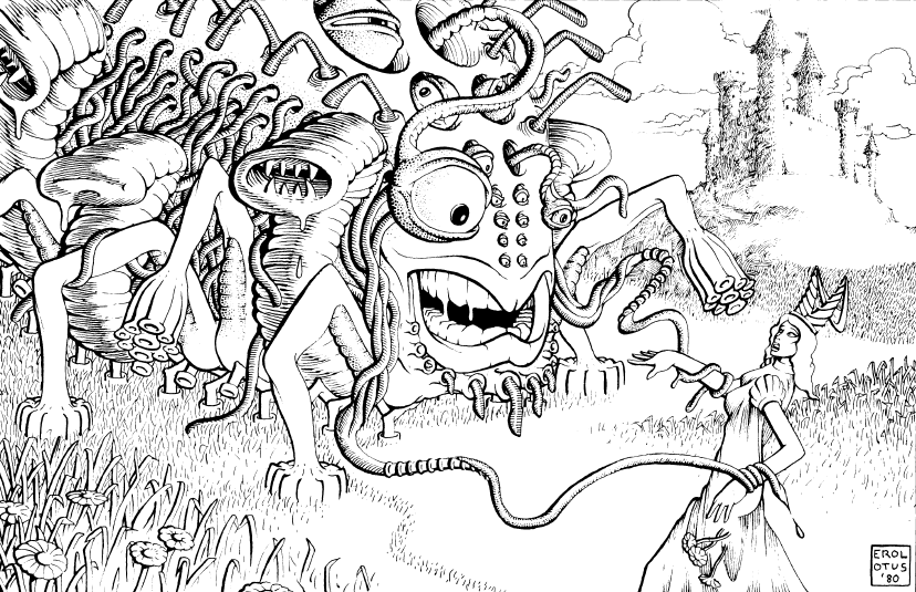
I have a ton of static Lovecraftian monsters from A-Ravlik I have been gently animating onscreen in combat. Very colorful and garish.

Switched back to these in place of AI generated monsters I created earlier because of comments about possible Steam conflicts.

They do go quite well with the AI generated portraits I have shown, in fact it's nearly a perfect match in artistic style.

I just bought a really good tile editor for the 3D on the Unity store actually designed for making PSX low poly games without using terrain but ground tiles instead. Perfect tool for making this style of game in combination with the Dungeon grid painting tool I have developed from an existing code base. The low poly artwork I got for PSX and mobile works extremely well if combined with a good cartoony stylized shader. Even the grimdark fishing village looks sort of comic book graphic art.

lovecraft_gpcs.png
 
Last edited:

Cleveland Mark Blakemore

Golden Era Games
Übermensch Developer
Joined
Apr 22, 2008
Messages
11,579
Location
LAND OF THE FREE & HOME OF THE BRAVE
I think I will be taking the title of another game to use for the Lovecraft blobber, I like it so much because it is generic and sounds more RPGish than the 1st person adventure game I had planned for that one.

View attachment 38708
Which Lovecraft deity/deities will you include? Or are you coming up with your own?
Deriving most of them from existing canon. A lot of Cthulhoids obviously judging by artwork above.
 

Cleveland Mark Blakemore

Golden Era Games
Übermensch Developer
Joined
Apr 22, 2008
Messages
11,579
Location
LAND OF THE FREE & HOME OF THE BRAVE
Variable size inventory slots going for each character individually! Body dummy slots showing equipment, all drag'n'drop. Screen shots coming shortly, now have to edit sufficient item data to support a lot of different sized equipment for testing. I think typical items will be displayed 64x64 going up to 128x128 with some long rifles etc. more like 64x196 etc.

Screen shots will be coming ... I tried it like Fallout with vertical stack of items you scroll through but just didn't like it and also thought it was too much like original FALLOUT One.
 

Cleveland Mark Blakemore

Golden Era Games
Übermensch Developer
Joined
Apr 22, 2008
Messages
11,579
Location
LAND OF THE FREE & HOME OF THE BRAVE
I think the viewport has too much vertical space for a blobber 1st person view. If you want to keep the size of the character boxes as they are now, it might be better to put them all on the left on top of each other.
I think I am going to end up stacking them like Wizardry in 3 rows of 3 on left and right. I've actually had it that way a couple of times.

If I stick to the same format, it will be instantly recognizable to players as the classic Wizardry layout no matter what the game genre is.
 

As an Amazon Associate, rpgcodex.net earns from qualifying purchases.
Back
Top Bottom