Stainless Veteran Wow. They're great on their own, and if they were drawn for BG2, they'd be just great. There's a slight problem though and I guess I should've been more specific about it, and I kinda feel bad for making you go slightly into the wrong direction here by saying that "I liked bg2's style".
I don't know how much experience you've got with BG2 and PoE, so here's how the styles of the two games compare.
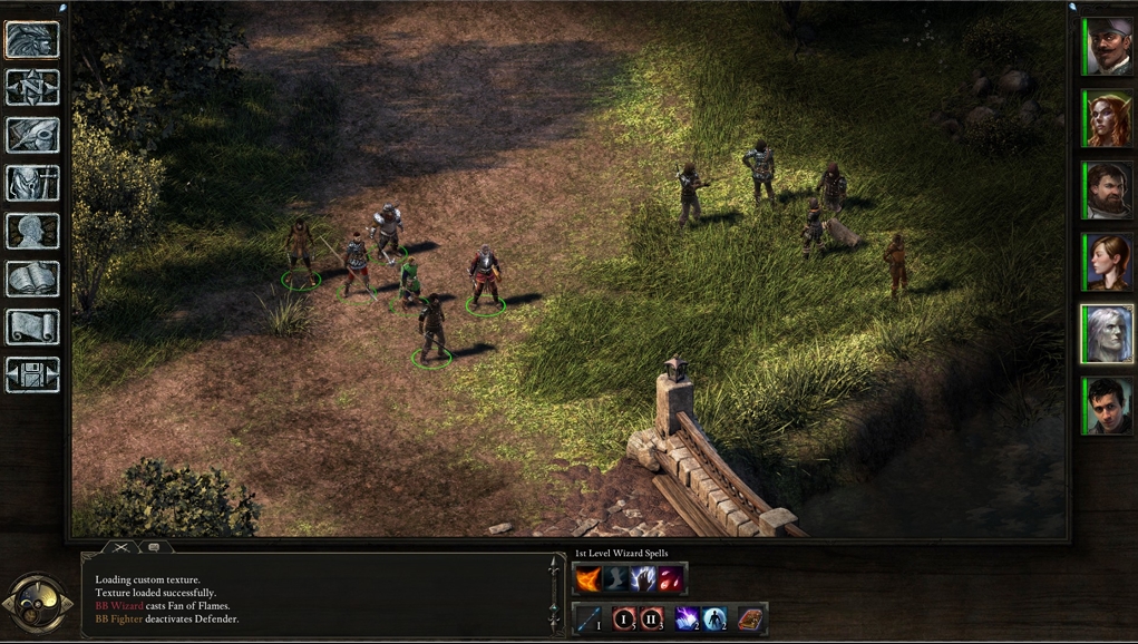
PoE's style is renaissance - very precise, thin, very articulate, very sharp. You can see that in the meticulous clock, you can see that in the log's corners. It uses dark gold colors. They have rifles in this game, hence renaissance I suppose.
BG2 - early christians style, byzantine style, sometimes even earlier. So it's crude, it's got fat lines, the material is very different too. Some icons in BG2 look like they could've been carved into stone by the stone age people - I'm talking about the rest icon and the character sheet icon (those two would have to go). In general, the details are vague, the icons more blurry.
Also, the background in BG2 is stone. In PoE it would be something more refined.
So I don't know if it's too late for those changes, but I hope it's not. :3