


-
Welcome to rpgcodex.net, a site dedicated to discussing computer based role-playing games in a free and open fashion. We're less strict than other forums, but please refer to the rules.
"This message is awaiting moderator approval": All new users must pass through our moderation queue before they will be able to post normally. Until your account has "passed" your posts will only be visible to yourself (and moderators) until they are approved. Give us a week to get around to approving / deleting / ignoring your mundane opinion on crap before hassling us about it. Once you have passed the moderation period (think of it as a test), you will be able to post normally, just like all the other retards.
You are using an out of date browser. It may not display this or other websites correctly.
You should upgrade or use an alternative browser.
You should upgrade or use an alternative browser.
Indie Bogarash [Early Access]: RT medieval hack&slash RPG for Windows
- Thread starter YanBG
- Start date

YanBG
Unwanted
- Joined
- Mar 10, 2016
- Messages
- 175
I have it real time for now but i plan to hook it with global time or turns. This is how diablo 1 is afaik, in the final version they just made the turns very fast. However, i haven't decided if the time should be tied to the player's actions, e.g. if you don't move the world is in waiting state as well or the time passes during when you think/stand.
Also i'm leaning towards some kind of party-based system but again not sure if it should be with followers(max amount based on main statistic: charisma) or "equal" party members.
Also i'm leaning towards some kind of party-based system but again not sure if it should be with followers(max amount based on main statistic: charisma) or "equal" party members.
The_Sloth_Sleeps
Arcane
- Joined
- Oct 26, 2016
- Messages
- 1,915
Its up to you of course, its been difficult for me to decide but it just didn't feel right to have real time for me...maybe because I'm not sure how to make a real time that's going to be any good. I do think the consensus seems to be in favour of turn based from what I can tell.
I played some really shitty rpg indie games on steam that were real time and they really put me off - its like a lazy cop out because the devs were too lazy to make a decent system, thats what I'm afraid of.
I played some really shitty rpg indie games on steam that were real time and they really put me off - its like a lazy cop out because the devs were too lazy to make a decent system, thats what I'm afraid of.
YanBG
Unwanted
- Joined
- Mar 10, 2016
- Messages
- 175
Yeah i change my design ideas with the years, first i wanted it to be like the games i played as a kid but now i prefer something with more depth.Make this party creation, turn based and with a Prelude to Darkness like story/quests and I'm game.
gotta keep dem standards high, folks!
I'm working on the world generation code now and there is not much new to show, but here is a screenshot. New GUI scheme for the quest log/journal(previously was like diablo2), each one have icon but they are on the left with the text next to them. If there are many active quests you can scroll through them, up and down. The background is a simple rectangle rather than a sprite looking like a book etc. On the right is the skill window, i plan to add the same background there. Not sure about the inventory and statistics window yet. Thoughts?

Last edited:
YanBG
Unwanted
- Joined
- Mar 10, 2016
- Messages
- 175
Mine was also bad in previous versions because there were targeting issues, easy misclicks etc. Now i check every object on a grid, the sprite can go outisde the cell but the base coordinates are always in only one of the isometric tiles. But yeah battle systems take a lot of work, i'm focused on the non-violent gameplay right now though.Its up to you of course, its been difficult for me to decide but it just didn't feel right to have real time for me...maybe because I'm not sure how to make a real time that's going to be any good. I do think the consensus seems to be in favour of turn based from what I can tell.
I played some really shitty rpg indie games on steam that were real time and they really put me off - its like a lazy cop out because the devs were too lazy to make a decent system, thats what I'm afraid of.
The_Sloth_Sleeps
Arcane
- Joined
- Oct 26, 2016
- Messages
- 1,915
Yeah i change my design ideas with the years, first i wanted it to be like the games i played as a kid but now i prefer something with more depth.Make this party creation, turn based and with a Prelude to Darkness like story/quests and I'm game.
gotta keep dem standards high, folks!
I'm working on the world generation code now and there is not much new to show, but here is a screenshot. New GUI scheme for the quest log/journal(previously was like diablo2), each one have icon but they are on the left with the text next to them. If there are many active quests you can scroll through them, up and down. The background is a simple rectangle rather than a sprite looking like a book etc. On the right is the skill window, i plan to add the same background there. Not sure about the inventory and statistics window yet. Thoughts?
Well its tricky to critique as its very much a WIP. Personally I like small (small text, icons), detailed UI's, with lots of slots. UI is so critical to a game I would spend as much time as possible getting it right. I must admit that I'm a bit of a cheater. I picked several games I liked and combined the ideas of their UI's to make the design of my own.
I think it would be more useful if you shared your design sketches or do some mockups in photoshop and show those. Then we can judge the ideas and its less effort to make a code mock up for each idea.
YanBG
Unwanted
- Joined
- Mar 10, 2016
- Messages
- 175
Well its tricky to critique as its very much a WIP. Personally I like small (small text, icons), detailed UI's, with lots of slots. UI is so critical to a game I would spend as much time as possible getting it right. I must admit that I'm a bit of a cheater. I picked several games I liked and combined the ideas of their UI's to make the design of my own.
I think it would be more useful if you shared your design sketches or do some mockups in photoshop and show those. Then we can judge the ideas and its less effort to make a code mock up for each idea.
Very good feedback for having small but detailed elements. I haven't really done any mockups before, but sounds like the way to go.
News: I've added BSP tree for dungeon generation, the rooms and corridors would look more natural now.


Character customization is getting more advanced, the player is cut into pieces and they change with the equipment(60-90 items). I plan maybe some more "races", right now is just recoloring. What do you think of the wording, shall i call them cultures? I don't want to add guys with pointy ears or green skin. :D


YanBG
Unwanted
- Joined
- Mar 10, 2016
- Messages
- 175
Great idea for a dlc mode, with online store. Faster horse or a new house, choice is yours.Make it a racing game.

The_Sloth_Sleeps
Arcane
- Joined
- Oct 26, 2016
- Messages
- 1,915
It may be worth taking a video to show how the UI works. UI is such a critical part.
I think some of the textures could be made more seamless. I have found a few ways of doing that, I use a paint .net plugin to help the edges blend in better.
I think some of the textures could be made more seamless. I have found a few ways of doing that, I use a paint .net plugin to help the edges blend in better.
YanBG
Unwanted
- Joined
- Mar 10, 2016
- Messages
- 175
Can you point me to a seam? Do you mean the big red texture that i use as a background?
I'll try to post a video in the next couple of days but there isn't much to see yet tbh.
For the character and equipment screens i had other ideas too, like placing the items on a big render of the human model or a tree of sort for the various player stats, but it's more difficult.
I'll try to post a video in the next couple of days but there isn't much to see yet tbh.
For the character and equipment screens i had other ideas too, like placing the items on a big render of the human model or a tree of sort for the various player stats, but it's more difficult.
I forgot which game was it but you see the armor directly on the hero:
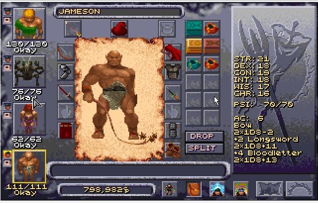
Pantheon, cancelled game but i like these menus:

Pantheon, cancelled game but i like these menus:
The_Sloth_Sleeps
Arcane
- Joined
- Oct 26, 2016
- Messages
- 1,915
Can you point me to a seam? Do you mean the big red texture that i use as a background?
I'll try to post a video in the next couple of days but there isn't much to see yet tbh.
For the character and equipment screens i had other ideas too, like placing the items on a big render of the human model or a tree of sort for the various player stats, but it's more difficult.
I forgot which game was it but you see the armor directly on the hero:
Pantheon, cancelled game but i like these menus:
Yes I really like those UI's.
As for seems maybe its hard to tell if you created but I drew a red box as an example. The eye is drawn to this repeating patterns that needs to be smoothed out.
https://imgur.com/a/SKEWKZl
For example if you use Gimp: https://www.gameartguppy.com/tutorial-how-to-create-a-seamless-texture-in-gimp/


bataille
Arcane
- Joined
- Feb 11, 2017
- Messages
- 1,073
I'm updating the menus. Added one more slot to the equipment and now the gold piles you carry take space from the inventory(nod to Diablo 1):

[/spoiler]
How do you consciously decide to add shadows to the disembodied body parts on the left? I'll be having nightmares for months now.


I plan to use the magnified equipment piece sprites for the inventory/paperdoll, as the game already use them.
The one in UO looks great, but don't they use different sprites for this?
I would also vote for Turn based part battles, or at least RT with Pause and a party, but TB is much easier to do well, as the player doesn't have to face both the AI and the UI at the same time.
The one in UO looks great, but don't they use different sprites for this?
I would also vote for Turn based part battles, or at least RT with Pause and a party, but TB is much easier to do well, as the player doesn't have to face both the AI and the UI at the same time.
YanBG
Unwanted
- Joined
- Mar 10, 2016
- Messages
- 175
I think they have 3 versions of the items: 1st for the character's battle animations, 2nd for the dropped items on the ground and 3rd bigger renders for the inventory screen. 2 and 3 are static with one frame.
Konung 2.5 doesn't have slots at all, downside is that with the fake 3d players can't rotate the inventory avatar.

Konung 2.5 doesn't have slots at all, downside is that with the fake 3d players can't rotate the inventory avatar.


As an Amazon Associate, rpgcodex.net earns from qualifying purchases.