Rpgsaurus Rex
Guest
Sure, and every post has to adhere to its original topic. Serious business.


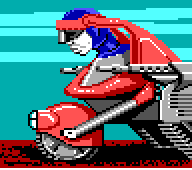
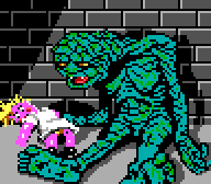
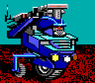
Guys, look how much SOUL this image I just made has!
Guys, look how much SOUL this image I just made has!
Guys, look how much SOUL this image I just made has!
I think the Blue Square represents non-conformity. The Blue Square chooses not to be cyan or lime green like most people and as a result is a more enlightened soul. Notice how we can bear to look at his soothing color and not the other two? Their conformity sickens us and our eyes.
Truly a work of art.
I don't think anybody seriously asked for 4-bit colors for portraits or anything of the sort. Doesn't change the fact that the dude presented here looks boring.
Technology has changed, cool, but why must the art style be totally revamped also?
There's actually some Russian Wasteland 2 fan-art thread on the forum that's been producing some really nice concept work. It has a more stylized, "frontier" look to it like a graphic novel whereas the artwork posted by Brian Fargo is your typical run-of-the-mill photorealistic digital painting. I like both, but anything they can do to drive the point home to Bio/Bethdrones that Wasteland 2 is not and does not want to be "Fallout 3 2" helps in my opinion.Could you show some artwork you would prefer instead?


I'm not impressed. I prefer the realistic approach over comicstyle.
It's not a comic style. It's half- assed pixel art.I'm not impressed. I prefer the realistic approach over comicstyle.
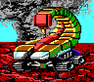
People could debate about this forever, but the biggest concern I have for the game's art direction right now is how the Scorpitron has individual legs instead of tread wheels. I always liked the original because it looked more like a tank (or RC car, the scale is hard to derive from the portrait) than a scorpion.I'm not impressed. I prefer the realistic approach over comicstyle.
I'm not impressed. I prefer the realistic approach over comicstyle.
You might prefer realism, but that kind of style is what makes Wasteland, well, Wasteland and not just another Fallout.
People could debate about this forever, but the biggest concern I have for the game's art direction right now is how the Scorpitron has individual legs instead of tread wheels. I always liked the original because it looked more like a tank (or RC car, the scale is hard to derive from the portrait) than a scorpion.I'm not impressed. I prefer the realistic approach over comicstyle.
There's actually some Russian Wasteland 2 fan-art thread on the forum that's been producing some really nice concept work. It has a more stylized, "frontier" look to it like a graphic novel whereas the artwork posted by Brian Fargo is your typical run-of-the-mill photorealistic digital painting. I like both, but anything they can do to drive the point home to Bio/Bethdrones that Wasteland 2 is not and does not want to be "Fallout 3 2" helps in my opinion.Could you show some artwork you would prefer instead?
Only going to hotlink one example, you can find the rest throughout the thread:
Yup, it's a bullet.
I'm not impressed. I prefer the realistic approach over comicstyle.
Wasteland and not just another Fallout.