Putting the 'role' back in role-playing games since 2002.
Donate to Codex
Good Old Games
  • Welcome to rpgcodex.net, a site dedicated to discussing computer based role-playing games in a free and open fashion. We're less strict than other forums, but please refer to the rules.

    "This message is awaiting moderator approval": All new users must pass through our moderation queue before they will be able to post normally. Until your account has "passed" your posts will only be visible to yourself (and moderators) until they are approved. Give us a week to get around to approving / deleting / ignoring your mundane opinion on crap before hassling us about it. Once you have passed the moderation period (think of it as a test), you will be able to post normally, just like all the other retards.

Unkillable Cat Box Nostalgia Thread

Unkillable Cat

LEST WE FORGET
Patron
Joined
May 13, 2009
Messages
27,233
Codex 2014 Make the Codex Great Again! Grab the Codex by the pussy
*checks out BlackCats*

Now that's the most mysterious site I've seen in years. Care to explain further (in a PM)?
 

King Crispy

Too bad I have no queen.
Patron
Staff Member
Joined
Feb 16, 2008
Messages
1,876,687
Location
Future Wasteland
Strap Yourselves In
If you have any more of those old registration cards, particularly from a game put out by some company that's still in business today, like Electronic Arts, you should fill it out and send it in. Someone there will get a kick out of it, especially being from Iceland (which to us Kwans is a mythical island).
 

Unkillable Cat

LEST WE FORGET
Patron
Joined
May 13, 2009
Messages
27,233
Codex 2014 Make the Codex Great Again! Grab the Codex by the pussy
Right, time to get serious. While going through my game collection I finally took the step of determining which "version" of the game I was in possession of. MobyGames proved to be an invaluable asset in this task, though even I noticed that MobyGames doesn't have all the answers - nor all the box covers. Along the way I noticed a trend - the US box covers tended to have inferior artwork compared to the European ones by a considerable margin.

It's a statement that needs to be backed up, of course, so I'm gonna dig up a few examples (based on my collection) and let the "Kodex Konsensus" debate the rest. For my first post, I'll start off with 5 games.

(All screenhosts courtesy of MobyGames, so any complaints about their quality should be directed there. Please let me know if any of them don't work.)

First up: Syndicate. For those that do not know, Syndicate is a top-down isometric RTS game (of sorts) set in a futuristic cyberpunk setting, where you, the CEO of a small but ambitious corporation, control up to 4 cyborg agents armed to the teeth with deadly weaponry, completing missions involving things such as theft, murder, kidnapping, assassinations, sabotage, more murder and vehicular manslaughter for the hell of it. Although never seen except in cut-scenes, you are controlling the action from your desk on your personal zeppelin that flies lazily overhead the mission area.

352-syndicate-dos-front-cover.jpg

The US has got the basic idea right with some of the imagery: A dark setting with the zeppelin flying overhead, a building that seems taken straight out of Blade Runner and a circuit board in the background. Clearly something cyberpunk about this one. But there are two things that kill this design for me: The game title's logo and colour, and then the gigantic blue head that dominates the image. It's an image that suggests a dehumanized element to the game, but otherwise has little relevance unless one considers the box art for the (inferior) sequel, Syndicate Wars.

6696-syndicate-dos-front-cover.jpg

The European version looks vastly different. The title font and colour is much smaller and more stylish, and the main imagery is confined to the upper left corner of the box, yet it gives a much better visual representation of what can be found in the game. The man in the front instantly grabs one's attention and is clearly an "enhanced" human agent of some faction or other (most probably the player's). And let's be honest, you want to own a leather jacket like that. The rest of the box, however, at first appears to be wasted on this neon-green coloured pattern that is rather eye-catching, to the point that people can recognize this box from a great distance. But closer inspection shows that this is another representation of in-game elements - namely the scanner that can be found in the bottom-left corner of the screen.

Syndicate also received an expansion pack called Syndicate: American Revolt. Bullfrog showed its laziest side ever when creating the box art here and only changed each version slightly. The US version got some extra text on the front, while the European version gets the American flag flying over most of the neon-green area, even though it's the American continents that have rebelled, not just the United States. Beyond this, the expansion boxes are identical to their original release designs.

Score so far:
Europe 1
US 0


Next up is Legend, also known in the US as the Four Crystals of Trazere. This is an isometric puzzle game in the vein of Sweevo's World, Alien 8 and Head Over Heels, but with added RPG elements. The party's spellcaster (there can be only one of each class in the party) is an Alchemist rather than a Wizard or Mage or Sorcerer, and a key element of the game is that the Alchemist can create his own spells, chaining together as many as 16 runes to create tailor-made spells to solve whatever conundrums the party may face. As a result it should come as no surprise that the box cover places an emphasis on the alchemy aspect of the game:

113637-the-four-crystals-of-trazere-dos-front-cover.jpg

There's nothing really wrong with the US cover except for the fact that it's a posed photo of real-life items, which I rarely like. (MicroProse were infamous for using those during the late 80s, and I'll touch upon one of those later.) The gathered items presented in the photo convey a greater sense of mysticism than alchemy, as if a fortune teller is out and about along with some armed guards. Not much of any magic going on either. The lack of people in the photo and the wasted upper part of the image doesn't improve things.

149423-the-four-crystals-of-trazere-amiga-front-cover.jpg

Talk about a different kettle of fish. This is hand-drawn, with a mysterious robed figure taking center stage, clearly engaged in either alchemy or magic, surrounded by filled with lots of little touches that suggest a fantasy realm. (It's not everyday you see owls on game covers.) The game's title is drawn into the cover, instead of hovering over it or being added at a later stage. This is Artwork, and a damn good example of it.

(I know that that's the Amiga version, but the MS-DOS version is identical but absent from MobyGames.)

Score so far:
Europe 2
US 0


For this next one, the preference is not based on relevance of the imagery, but more about its presentation. I give you Dune 2: The Building of a Dynasty. It's the game that defined RTS games and kickstarted the genre. As most people should know, the game revolves around battles on the desert planet Arrakis.

81531-dune-ii-the-building-of-a-dynasty-dos-front-cover.jpg

Nothing wrong with this one, per se. An image relevant to the game and its content is presented in a gold-glossed frame and title. Still, the image feels...lifeless, stale. It raises more questions than answers. How come one soldier is all we get? Where are the military forces that we end up using to battle the enemy forces? Where's the sense of scale? Where's the combat? This gives people the idea that we're a lone faceless, nameless Master Chief-wannabe precursor that's striking a pose just before he single-handedly turns the tide of the war. The skyline background is beautiful, though. Makes me wonder if they put up the frame to preserve that.

34539-dune-ii-the-building-of-a-dynasty-amiga-front-cover.jpg

This is a completely different take on things. Boxes that dare go for the "large empty black spaces" need to know what they're doing, and in this case the minimalist approach works wonderfully, yet grabs people's attention. Not only is the title clearly visible (and in the proper font, considering the other Dune game) but the only real image present says a simple message: There will be war on Arrakis. This version can easily be dismissed as overly arty-farty, but it makes for a damn impressive image.

Score so far:
Europe 3
US 0


One thing that tends to happen is when both versions use the same basic artwork, but something has been added (or removed) to set them apart. There are many examples of this, but for now I'll start with Lands of Lore: The Throne of Chaos. I'm not gonna waste time on an introduction, so let's just get right to it.

68313-lands-of-lore-the-throne-of-chaos-dos-front-cover.jpg

RPGs suffer from the fact that they can rarely give an image of the player character himself (for obvious reasons) so box cover artists tend to go for imagery of the antagonist instead. As Scotia makes for a memorable antagonist (at least in appearance) she makes an excellent choice for the cover of Lands of Lore. This box art conveys a simple message - Scotia is an evil hag that has seized the throne. The only downside to the US version (if any) is that the game's title gets a little little lost in the golden-glossed letters up top.

142153-lands-of-lore-the-throne-of-chaos-dos-front-cover.jpg

Here is where Europe slips up, however. The powerful image from the US box is reduced, both in size and graphical quality (the image takes it overboard, but the image IS degraded on Euro boxes) and a frame of stonework is thrown all around it, leaving the title to claim the upper half of the box. This is a pointless change for me. It makes the box art easier to identify, but in all other terms I'd rather have the US version.

Score so far:
Europe 3
US 1


To round things up, I'll present a box that proves the exception to my rule - an example where the US version is better than the European one.

Alone in the Dark, the original 3D survival horror game featuring VERY basic 3D graphics, horrible controls and even more horrible camera angels, at least had relevant box art.

440-alone-in-the-dark-dos-front-cover.jpg

Basic, simple, powerful. A man wielding a lantern standing in front of a haunted house. Good use of colours, the vantage point and angle allows the sky to be a relevant part of the image and underlines that the house itself is the primary antagonist. If anything, the image totally contradicts the title of the game but that's another matter entirely.

2721-alone-in-the-dark-dos-front-cover.jpg

Thematically it's the same image as above, but clearly done by a different illustrator. It's got the "dark" part of the game nailed down, but it just doesn't compare to the US version. I should point out that in re-releases of AitD (the CD versions in particular) this image was dropped in favour of the US one, so it's actually kinda uncommon nowadays.

Score so far:
Europe 3
US 2


Don't think that the score above is an indicator of me being wrong, I'm just getting started. But more will come later.
 

Unkillable Cat

LEST WE FORGET
Patron
Joined
May 13, 2009
Messages
27,233
Codex 2014 Make the Codex Great Again! Grab the Codex by the pussy
Moderators - could you edit the title to include a "artistic faggotry debate" in it somewhere?
 

mindx2

Codex Roaming East Coast Reporter
Patron
Joined
Feb 22, 2006
Messages
4,429
Location
Perusing his PC Museum shelves.
Codex 2012 PC RPG Website of the Year, 2015 Codex 2016 - The Age of Grimoire RPG Wokedex Serpent in the Staglands Divinity: Original Sin Project: Eternity Torment: Tides of Numenera Wasteland 2 Shadorwun: Hong Kong Divinity: Original Sin 2 BattleTech Pathfinder: Wrath I'm very into cock and ball torture I helped put crap in Monomyth
Sorry my friend but I think the US Syndicate box is visually more striking. The EU color is puke green... :eek: The others I agree with you so in my book:

Score so far:
Europe 2
US 3


:smug:
 

SerratedBiz

Arcane
Joined
Mar 4, 2009
Messages
4,143
I disagree so much on the Dune 2 covers. The US version is much superior, in my eyes, because of how recognizable it is even after all these years. It gives the player/buyer the general impression of the kind of stuff you'll find in the game: an alien planet, as portrayed by its two suns, futuristic buildings and infantry, warfare. The light infantry is obviously the point man for a larger force, left to our imagination, in what is either the defense or further attack of the assaulted wind traps.

Meanwhile, the EU version - while, indeed, more artsy - is completely forgettable. Sandy landscape, burning in the distance. It may well be a Lawrence of Arabia adaptation, by the image. Sure, the subtitle tells us this is happening in Arrakis, which sounds exotic enough, but the US cover can actually skip telling us that because it's already apparent from the art itself. Even if you're familiar with the Dune setting, telling you it happens in Arrakis is superfluous while displaying the particular art design of the game (which I always found very appealing) is the superior choice.

ETA: I also find the US Syndicate cover to be better but I have no arguments to back up my claim, other than I like it more. Puke green, generic future soldier art doesn't strike me as an attractive cover. Dehumanization works a lot better in the US one and it already plays into the Blade Runner vibe which they were going for.
 

DwarvenFood

Arcane
Patron
Joined
Jan 5, 2009
Messages
6,408
Location
Atlantic Accelerator
Strap Yourselves In Serpent in the Staglands Dead State Divinity: Original Sin Project: Eternity Wasteland 2 Codex USB, 2014 Divinity: Original Sin 2 BattleTech Pillars of Eternity 2: Deadfire
Agree on most covers, but the EU Dune looks a bit too pixelated, not sure if it's a problem with the photo or the cover itself. I'm leaning more to the US version on that one.
 

Unkillable Cat

LEST WE FORGET
Patron
Joined
May 13, 2009
Messages
27,233
Codex 2014 Make the Codex Great Again! Grab the Codex by the pussy
Agree on most covers, but the EU Dune looks a bit too pixelated, not sure if it's a problem with the photo or the cover itself. I'm leaning more to the US version on that one.

All screenhosts courtesy of MobyGames, so any complaints about their quality should be directed there.

Time for the next batch of games.

Discworld 2 had this bizarre thing about differences between regions. Different undertitles and completely different box cover art. I think it may have something to do with Josh Kirby's work being involved.

94425-discworld-ii-mortality-bytes-dos-front-cover.png

At least the image is appropriate, but beyond that it's just vastly inferior to the European one. Death looks like a robot skeleton while Binky and Rincewind look too cartoonish.

52848-discworld-ii-mortality-bytes-dos-front-cover.jpg

But here we have original Josh Kirby art. You can't have Discworld without Kirby, someone said. Though Death is strangely absent, The Luggage and the Librarian help make up for it.

Score so far:
Europe 4
US 2


Then we descend into...Descent. This is another ambigious one that boils down to personal preference, though in this case I prefer the one relative to the game, rather than the neat-looking box.

1814-descent-dos-front-cover.jpg

I'll give it that, it uses an interesting choice of colours that help make it easily recognizable. But beyond that...what is this? There's a very zoomed-in image of a Miner droid in the background, but that doesn't really say much. In fact, this box cover doesn't tell us anything at all, except a forced "360° environment" blurb. These kind of box designs make me think they're hiding something when they shouldn't.

105632-descent-dos-front-cover.jpg

This one doesn't tell us much either, but what it does tell us is enough. It's a game that takes place underground, and the mention of 360° action is now seamlessly inserted into the image.

Things don't get better if we'd look at the sequels, but at least the US boxes stay consistent with the two-colour division and blue energy sphere being present. Whatever.

Score so far:
Europe 5
US 2

Next up we get to one where both versions started out weird and inappropriate, only for a re-released cover to pop up and save the day. I'm referring to Legend of Kyrandia 2: The Hand of Fate.

95032-the-legend-of-kyrandia-hand-of-fate-dos-front-cover.png

Someone clearly had nothing to work with here except the "Hand of Fate" part of the title. Garish colours, meaningless imagery...this is just horrible. So let's see how the Euro version trounces it-

152292-the-legend-of-kyrandia-hand-of-fate-dos-front-cover.jpg

...WHAT THE FUCK IS THIS SHIT?!?

Tarot cards on a wooden table? In a game with no tarot cards present? Or a fortune teller for that matter? And look at that title artwork. This is worse than meaningless imagery, this is contradictory imagery. Clearly the covers were made before the game even hit alpha.

Someone at Westwood noticed this and tried to address the problem. My bet is that he saw the Japanese cover...

216237-the-legend-of-kyrandia-hand-of-fate-fm-towns-front-cover.jpg

:desu:

Now THIS is a box cover. It shows the protagonist, the gameworld and a near-exact reproduction of a scene from the game. We can recognize that this is Zanthia, but certain...artistic liberties have been taken.

Anyway, this was used as the basis to make a new cover for us Westerners:

113772-the-legend-of-kyrandia-hand-of-fate-dos-front-cover.jpg

This design is consistent with the prequel's design and artwork, and does all the exact same things as the Japanese cover. It even does away with the "Hand of Fate" thing to put better emphasis on it being a Kyrandia title. It's beautiful.

And who got this cover? 'Murica. Europe got stuck with the Tarot card one, even through the CD and budget re-releases. Ugh.

Score so far:
Europe 5
US 3
(Japan 1)


The next one comes kinda out of left field as we go all the way back to the 80s, but the US vs Europe division is still strong here as we board Space Station Oblivion - more commonly known today as Driller.

Driller was the first of the Freescape games, the first engine to accomplish "true 3D in a first-person-perspective" thing - just not in real-time. ;) The game's plot is that you're flying a small scout craft that's surveying a moon's surface for dangerous gas deposits, then calling in large drill rigs to tap the gas before it ignites and blows up the entire moon, all on a timer! So let's see how two different box covers approached the game.

Impressive...if only I knew what exactly I was looking at. There's the scout craft, the drill rig makes a small appearance, but otherwise this all seems very bizarre and doesn't really tell us much.

185143-space-station-oblivion-commodore-64-front-cover.jpg
This is more simpler and to the point. The scout craft is in the foreground and a drill rig in the background, both set against a scene that's more fitting of what can be seen in-game. The scene is not as busy as the US one, but then again we're not left scratching our heads what's going on either.

Score so far:
Europe 6
US 3


Now we come to a game where I had to double-check that I was actually looking at a box cover. Gobliiins, the first game starring a ever-shrinking group of goblins who must solve bizarre puzzles in a bizarre world to progress through somewhat normal storylines.

7568-gobliiins-dos-front-cover.jpg

What's wrong with this one is that it's not really a box cover, is it? It looks and feels like a magazine advertisement. It's rare that a box cover needs an ad blurb to be present (though I'll admit that the "You're next" line is superb) and most of the art is taken up by a frame full of skeletons for some odd reason (though skeletons do appear in the game).

47427-gobliiins-dos-front-cover.jpg

The European version, however, springs for a full frontal artwork which depicts a scene from the game if I'm not mistaken (haven't played the game in close to 25 years). All three protagonists are present, their differences outlined and there's another skeleton.

Score so far:
Europe 7
US 3


I'll continue in a bit.
 
Last edited:

:Flash:

Arcane
Joined
Apr 9, 2013
Messages
6,482
I disagree on Descent. They're both abstract and not representative of the game. However, the U.S. version is well done artistically, whereas the Euro version looks like someone just discovered some features of his image editing program.

And you need to do Another World / Out of this World. It was included in both LGR's best game cover and worst game covers videos
 

:Flash:

Arcane
Joined
Apr 9, 2013
Messages
6,482
Yeah Cat, you got the descent and Kyrandia ones wrong. US versions are much better... "artistically." so:

Real score so far:
Europe 5
US 5


:smug:
UC rates Kyrandia as a US win, so if he got that wrong, the real score would be even worse for US.
 

Unkillable Cat

LEST WE FORGET
Patron
Joined
May 13, 2009
Messages
27,233
Codex 2014 Make the Codex Great Again! Grab the Codex by the pussy
He actually rates it as a Weeaboo win but I'll ignore that one....+M

Actually I gave a point to both the US and Japan for that one, as the latter saved the former. The Weeaboo point just doesn't pop up again.

If I had wanted to be a bastard I would have compared Kyrandia 3, but that's like kicking a puppy while it's down.

EDIT: If anyone's wondering about the constant edits to the second box comparison post, it's because I screwed up once and the error flowed through the rest of the document, cancelling all the spoiler and image tags and what not. It should be fixed now.
 
Last edited:

Unkillable Cat

LEST WE FORGET
Patron
Joined
May 13, 2009
Messages
27,233
Codex 2014 Make the Codex Great Again! Grab the Codex by the pussy
Thanks for reminding me of this, I just remembered that I had left to do at least one more "US vs Yurop!" post on box covers.

Speaking of which, the Laser Squad covers. The upper one is the "original" 1988/1989 box cover, while the latter is for the PC (16-bit?) release in 1992.

I haven't checked their nationalities yet, but the upper one wins in my books. It has a little of that 70s/80s sci-fi vibe going through it, sports bright colours and is easily recognizable. The latter one, while sporting some cool character models, feels like a poster for Teenage Mutant Power Rangers: The Movie. All it needs is a tag line: "Sterner Regnix crossed the wrong squad" or something.
 

Kutulu

Arcane
Patron
Joined
Aug 3, 2015
Messages
1,378
Location
ger
PC RPG Website of the Year, 2015 Codex 2016 - The Age of Grimoire Make the Codex Great Again! Grab the Codex by the pussy Insert Title Here RPG Wokedex
U7 is a different beast all together as the regular game is effectively the collector's edition. Those cloth maps and trinkets cost money to manufacture. I'm talking about games that were printed on regular DVD/CD/plastic cases in the first place. Like that Konami's best rerelease of Dawn of Sorrow, or shit like this
6038_front.jpg

_-Anachronox-PC-_.jpg
You could just print the regular cover art and it would take less effort and wouldn't cost you any more money. The third one looks by far the best and it's a budget release afaik (original was a cardboard big box)

Yeah that would have been better, but nobody cared back then.
You know console games like Nintendo Stuff came in Carton/Paper Boxes, people threw them away instantly, nobody gave a fuck.
Thats the reason why they are worth so much when MiB/NiB (New/Mint in Box).

Americans cared enough for moduls to pay for them, europeans didnt. Nowadays its a bit different but 10 years ago prices would be like this:
Europe: Modul/Cartridge = 10$, with Box & Manual = 120$.
Murrica Modul/Cartridge = 50$, with Box & Manual = 100$.
 
Joined
Jul 26, 2015
Messages
1,350
PC RPG Website of the Year, 2015 Codex 2016 - The Age of Grimoire Make the Codex Great Again! Grab the Codex by the pussy Divinity: Original Sin 2 BattleTech Bubbles In Memoria A Beautifully Desolate Campaign Pillars of Eternity 2: Deadfire Pathfinder: Kingmaker Steve gets a Kidney but I don't even get a tag.
I disagree on Descent. They're both abstract and not representative of the game. However, the U.S. version is well done artistically, whereas the Euro version looks like someone just discovered some features of his image editing program.

And you need to do Another World / Out of this World. It was included in both LGR's best game cover and worst game covers videos
The US Descent box was definitely less shitty than the Eurotrash version. Most of the other boxes were rated correctly ;)
 

Unkillable Cat

LEST WE FORGET
Patron
Joined
May 13, 2009
Messages
27,233
Codex 2014 Make the Codex Great Again! Grab the Codex by the pussy
Right...better finish what I started.

5 more boxes where I measure up US boxes to European boxes, then I'm done.

First up, that MicroProse box I promised earlier, where not only real-life items are used on the cover, but in this case real-life people - the original release of Sid Meier's Pirates!

25319-sid-meier-s-pirates-pc-booter-front-cover.jpg

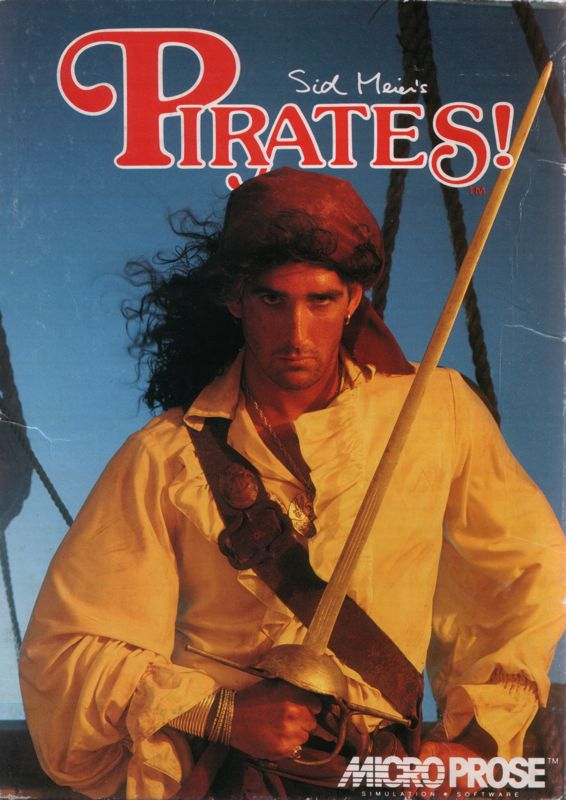
He may be a handsome looking devil, but he's no Jack Sparrow. While the image gets the message across that this is a game about pirates, it just irks me somehow - video game boxes should not have real-life imagery on their covers - that's cheating.

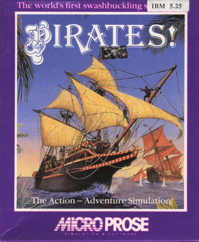
The thing is, this is one of two US box covers for the game, the latter of two. This is the second one, the original box cover:

114415-sid-meier-s-pirates-pc-booter-front-cover.png

This is more like it. A drawn image that doesn't leave any ambiguity about what's going on in this game. Let's see what Europe came up with.

5594-sid-meier-s-pirates-pc-booter-front-cover.jpg

This is the cover most Europeans are familiar with. A simple image of naval combat during the Age of Sail, but sadly it only hints at the game's content (yes, I'm aware of the giant "PIRATES!" logo above).

I'll be honest, I went in blind on this one. I wasn't aware of the second Pirates cover until I did the research, which instead of making this a sure Euro-win, made this a US-win.

The score so far:
Europe 7
US 4

Next up is the crime against vision that is the box cover art for Impossible Mission 2.

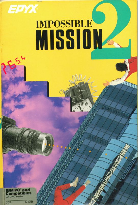
Just to make sure everyone is on the same page, Impossible Mission 2 takes place in a skyscraper complex of 8 towers that Agent 4125 must navigate through alone to find the code fragments to Atombender's safe, while dodging his non-humanoid robots with nothing but his agility and the occasional software hack, all in a race against time before Atombender blows up the world (?!?). So yeah, pretty much like the original. With that said, let's start with the original US box cover from 1988.

58006-impossible-mission-ii-dos-front-cover.jpg

At least it has a skyscraper and a timebomb, which is somewhat relevant. It also has a falling guy, which is something that happens A LOT in the game. The rest of it, however...I'm at a loss for words here. It clearly states "I'm a product of the 1980s!" but fails to accomplish anything else.

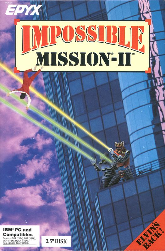
In 1989 the game is re-released, now with EGA and VGA support (beforehand it was only 4-colour CGA). They changed the box cover, and we got this:

13416-impossible-mission-ii-dos-front-cover.jpg

For those that haven't seen it, this is a follow-up of the same image used in the first box cover for the game. It's the same skyscraper, same background, the same falling guy. The only difference is that most of the atrocious 80s artstyle has been thrown out (yay!) for...a couple of humanoid robots firing upon the falling guy (ugh).

Well, the game DOES involve robots, so that makes it legit...right?

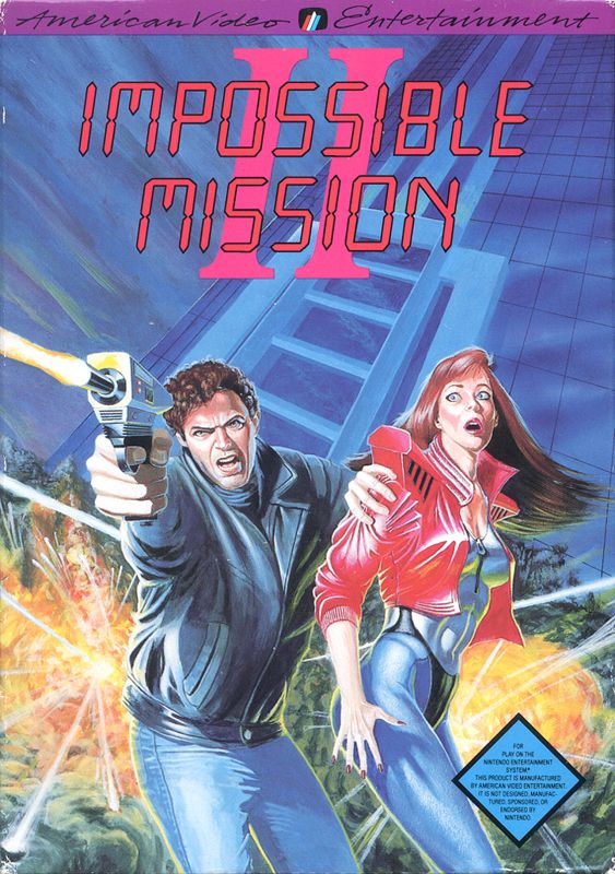
Before I give you the European cover, let's have a look at Strike 3 for the US.

14554-impossible-mission-ii-nes-front-cover.jpg

This is the NES cover for the game. It has a skyscraper, bonus point for the New Retro Wave outfit of the girl, but her mere presence (not to mention the gun) just makes the whole thing look horrible. He works alone, in case anyone forgot. Also, the two of them look familiar somehow, like they're caricatures of famous actors from the late 80s or something. Just another case of an illustration hi-jacked for this role.

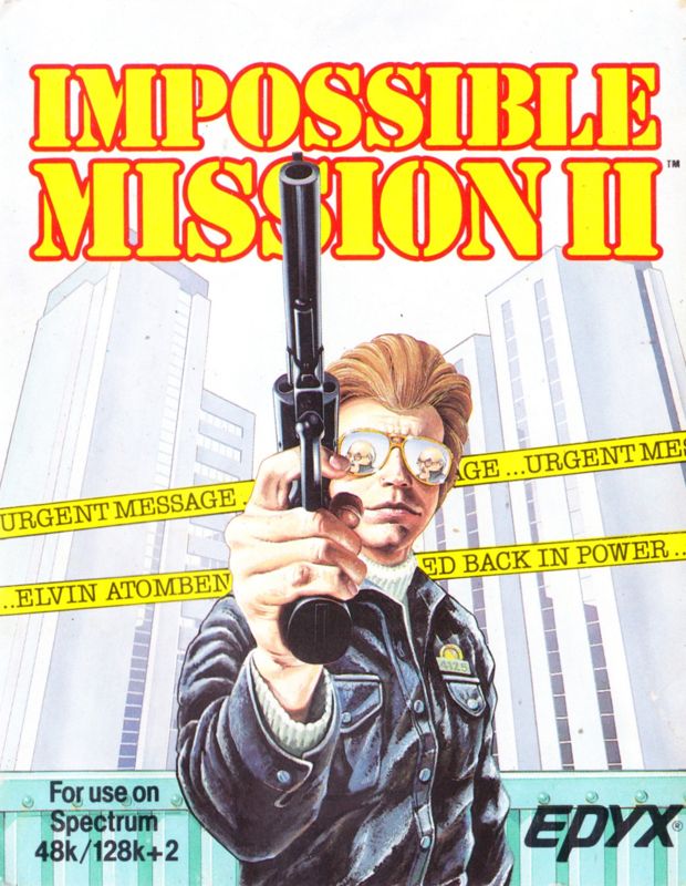
But then we get to the European version, where one hopes some shred of common sense would prevail.

300936-impossible-mission-ii-zx-spectrum-front-cover.jpg

Cool image, except this isn't the latest Dirty Harry film. Skyscrapers are in, the protagonist is in, his "name" is visible, the ticker tape is relevant to the game, but that cannon of his...Agent 4125 is supposed to be UNARMED. Even if he had a gun, he never uses it. This looks like the cover art for Die Hard if it had starred Clint Eastwood instead of Bruce Willis.

It's the most sensible of the covers, but the truth is it's just as bad as the others. No points awarded.

Score so far:
Europe: 7
US: 4
(Common Sense: -1)

Now we get to a game that (to me anyway) is a clear case of "How could you screw this up?" The game in question: Midwinter 2: Flames of Freedom, the sequel to Mike Singleton's over-ambitious arctic post-apocalyptic "real-time" strategy game from 1990 that takes place in what's left of the Azores. A group of survivors from mainland Europe have settled this new piece of land, only to have a second group of war-like survivors land on the island and attempt to take it over. The first game dealt with an Earth that's frozen due to fallout from a comet strike, the sequel deals with a world that's starting to thaw out and humanity crawling from its hiding places to try to assert dominance again. And all the vehicles visible? You can use them in-game. Yes, even the tram.

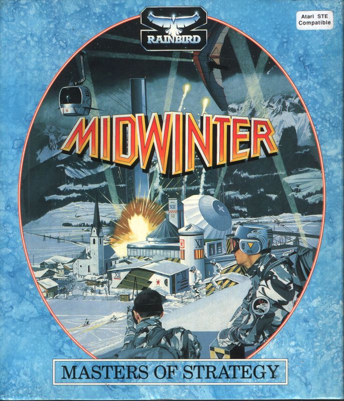
Before I can show you the atrocity of the Midwinter 2 box, I must show you the Midwinter 1 box first, so you can see where I'm coming from.

49263-midwinter-atari-st-front-cover.jpg

(I'm aware that there are minor differences between the US and European versions of this game cover, but they're negligible, most concernig publisher logos.)

This is nice box art because it gets a few basic themes across. The main image is kept within an egg-shaped frame, the game's title has an attention-grabbing look and colour, the image displays what's contained in the game (arctic warfare) and everything's in colours that's relative to the game and its content. You really can't go wrong with this.

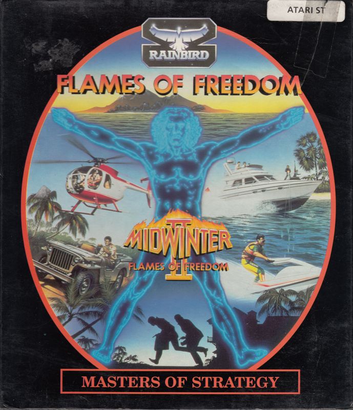
So when Europeans grabbed their copy of Midwinter 2, they got this:

264587-flames-of-freedom-atari-st-front-cover.jpg

(Yes, I know that's the Atari ST version, MobyGames didn't have the European PC version.)

This one follows in the footsteps of the prequel's box cover, almost down to every detail. I'll admit I have no idea what the Da Vinci-esque man is doing there spread-eagled across the image, but at least he serves as a nice divider between the various activities that can be done in the game (yes, all of those vehicles (and more!) can be driven in Midwinter 2). For anyone that's even just glanced at the cover to Midwinter 1, it's clear as day that this is the sequel to that game.

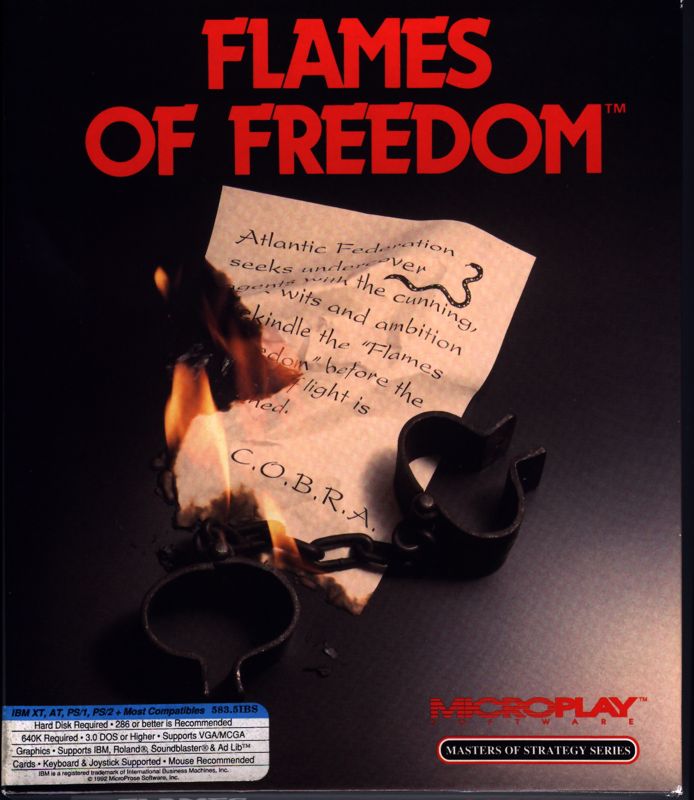
But then some suit-wearing mouth-breathing mongoloid :patriot: decides that he can do better.

3845-flames-of-freedom-dos-front-cover.jpg

Talk about sucking everything out of a game in one fell stroke. The factions mentioned in the note are in the game, and the shackles are relevant to the struggle for freedom that Midwinter 2 is about...but beyond that this is as far from the original as one can imagine. What the fuck, America?

Score so far:
Europe 8
US 4


Now we step into the 21st century and get a lesson in the priorities between Europe and the US. The game in question? Serious Sam: The First Encounter. The first game to try to be like Doom since Doom 2. Everyone knows Doom's cover, the iconic last stand against a heap of demons by a battle-scarred marine. Well, someone thought it was a good idea to try to copy that for the US cover of the game.

117557-serious-sam-the-first-encounter-windows-front-cover.jpg

Not bad at all. It's drawn, even though it's going for ultra-realism. It shows the protagonist in the thick of it, fighting baddes from the game, in a setting that's in the game, and all without looking overly silly (except for that fire-spouting thing at the bottom. What is that?) This cover does two things quite brilliantly: It tells people what to expect of the game, and it shows a connection to Doom.

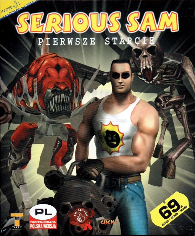
Most of Europe, however, got a dose of minimalism instead:

55005-serious-sam-the-first-encounter-windows-front-cover.jpg

It takes balls to go for the minimalist approach with a black background. While there's nothing wrong with this image, it could be better. This one uses the in-game model for Serious Sam instead of a hand-drawn recreation, and he IS spouting a really big gun. But the US cover accomplished so much more.

Bonus image: The Potato version of the SSam1 box cover:

306700-serious-sam-the-first-encounter-windows-front-cover.jpg

(Makes you think those monsters are his friends.)

Score so far:
Europe 8
US 5

Finally I'm gonna bring you another Freescape title, this time it's Total Eclipse from 1988. The plot is that you, a prestigious archeologist in the 1930s, has discovered that an old Egyptian prophecy about the end of the world is about to come true with the next total eclipse of the heart sun. There's a way to avoid the cataclysm, but it involves a ritual in a pyramid in Egypt. You arrive there with only 2 hours to spare before the eclipse...

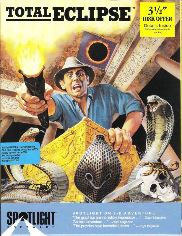
So how did our favorite competitants succeed in getting this across? Let's start with the US:

228738-total-eclipse-dos-front-cover.jpg

Interesting. This clearly suggests that the player will be facing dangers and threats in an Egyptian setting. The eponymous eclipse is just a small detail in the background, but the biggest problem here is how misleading the image is. While there are dangers and critters in this game, the truth is that the focus is more on exploration, navigation and puzzle-solving. It reminds people of Indiana Jones, and makes you immediately wonder where he's left his whip.

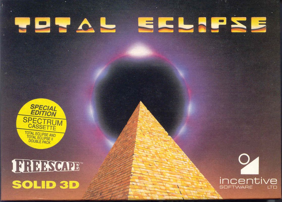
Europeans, however, got this:

38959-total-eclipse-zx-spectrum-front-cover.jpg

Here the title of the name literally steals the show. There's a pyramid, there's a total eclipse...and that's it. A very striking image (that's actually taken from the game, you get that same vantage point showing the eclipse if you lose the game) but it actually doesn't tell you anything about the game except for a couple of obvious themes. If I could take a neutral stance here, I wouldn't vote either one, but the fact that I've owned a copy of the European version (it's right next to me as I type this) for over 25 years makes me partial to the imagery, so Europe gets the vote here.

Final Score:
Europe 9
US 5


I could go on with a few more boxes (UFO: Enemy Unknown vs X-Com: UFO Defense; the original SimCity) but this has been too much work already. I hope you've enjoyed this and aren't too butthurt about it.
 

Unkillable Cat

LEST WE FORGET
Patron
Joined
May 13, 2009
Messages
27,233
Codex 2014 Make the Codex Great Again! Grab the Codex by the pussy
The REAL reason I decided to "finish up" with the above post, is because I was gonna use this thread to post about something else, but couldn't for the life of me do so before wrapping up the box comparisons.

What I wanted to post about was my old Amstrad CPC 6128 that has been sitting in storage for over 22 years now. I dug it out and thought I'd see if it worked.

Simply plugging everything in and turning it on worked: That ol' blue screen with yellow text came up, but before I could test my discs (let alone the drive) I ran into my first problem: The keyboard responded as if I was typing on it with hooves. Pressing "O" gave me "OLK", pressing "A" gave a *BREAK* prompt, etc. So clearly the keyboard was clogged with dust and needed cleaning. So after consulting a few videos, I took the computer apart, blew out the dust, checked all the parts for obvious problems...and saw my second problem: The drive belt had snapped. There was no point in firing up the computer if I couldn't use the drive, so after a few minutes of contemplation I replaced the drive belt with a rubber band, put everything back together and tried again.

...

...it worked. The drive is a little louder than I remembered, and the monitor flickers now and again, but beyond that the computer works perfectly. Then I dug out the discs. Various discs containing programs, word processors, a couple of games - I tested about a dozen of them, and they all worked perfectly. We're talking about a 30-year old computer running 25-30 year old 3" discs...and they still work today. I'm gonna bring out the rest of the boxes of Amstrad games I have lying around tomorrow and see what's what.
 

Unkillable Cat

LEST WE FORGET
Patron
Joined
May 13, 2009
Messages
27,233
Codex 2014 Make the Codex Great Again! Grab the Codex by the pussy
GraffitiMan.jpg


:lol:

What is this, I don't even

Looks more like a David Bowie album than a video game.
 

Unkillable Cat

LEST WE FORGET
Patron
Joined
May 13, 2009
Messages
27,233
Codex 2014 Make the Codex Great Again! Grab the Codex by the pussy
Right, I'm hijacking my own thread for some thoughts and occurences as I've been dabbling with my Amstrad. The rubber band broke so the disk drive is out again, but I think I have found a proper belt ready for it, so I'll try installing that sometime soon. In the meantime I've connected a tape recorder to my Amstrad and have been loading up my tape-based games - which makes for a wonderful social experiement on patience and diligence. Getting everything set up and starting loading the first tape took about 15 minutes - followed by ANOTHER 10 minutes waiting for the first tape to load.

What I discovered:

# I've gone through close to 100 tapes now, and only five of them don't work anymore. Though I faintly recollect that at least two of them never worked in the first place, but that's still some AMAZING preservation from such a flimsy media, 25 years later.

# Many tape-based games would waste time and space by first loading up generic copyright messages before loading up the game itself. Football Manager 2 took this one step further by cramming in a pure-text advertisement for an upcoming title!

# Game developers back in the day found some...interesting methods to make home computer conversions be comparable to their coin-op counterparts. My copy of Out Run, for example, has a disk AND a tape. But the tape doesn't contain the game itself - instead it has the SOUNDTRACK from the game, recorded straight from the coin-op machine! Another game, Side Arms, has the game data on Side A, and a music track from some band on the other side.

# GUI development has advanced LIGHT YEARS in 25 years. The example I'll give for this is Space Crusade, a top-down icon-driven strategy game very much like Lazer Squad and X-Com. I use they joystick (or keyboard) to move the cursor around. If I want to move the game map around, I don't move the cursor to the edge of the screen, but instead I must click special directional cursors on the map border. All orders are shown as buttons with images on them - but they have no tool-tips. You HAVE to consult the manual to know what each icon means (and some of them are quite vague).

# The Amstrad only has a single soundchip to play all sounds, which can lead to some awful-sounding noise coming from the computer. But when it's used to make music, the results can be interesting. A game called "Icon Jon" does a pretty good rendition of the chorus of Ode to Joy. "Head Over Heels" has a few short tunes, including How Much is that Doggie in the Window?. The Rocky Horror Picture Show (yes, they made a game based on that) does a good job of The Timewarp, but it plays it non-stop on repeat to the point of nausea. Football Manager belts out Here we go! Here we go! Here we go!, while both "Mickey Mouse the Computer Game" and "Sorcery+" have different takes on The Sorcerer's Apprentice - the Mickey Mouse one is a complete version and sounds cool, while the Sorcery+ one only captures a few seconds of the piece and sounds like the Amstrad is drowning. Meanwhile, games like "Robocop", "The Last V8", "Bad Dudes vs DragonNinja" and "Daley Thompson's Olympic Challenge" manage to play some awesome and catchy tunes. A couple of the Dizzy games, in addition to having some nice tunes, also manage short bursts of digitized speech.

# Amstrad games in general are slow, slow, SLOW. Sometimes a game is running along nicely, only for one more baddie to appear on-screen and everything slows down to a crawl.

# The first Batman video game ever made ("Batman '3D'" by Jon Ritman and Bernie Drummond) is one endless barrage of cheesy trolling from the devs. We're talking "I Wanna Be The Guy!" levels of cheese here. Let me give you a couple of examples:

batman.png


This is one of the first screens of the game, and a vital one as the first part of the game involves Batman gathering his gear. The boots on the right allow Batman to jump, which is the only way he'll be able to get back up to the grey conveyor-belt platforms you see (not to mention allowing Batman to go "against the flow" on such platforms. That grey baddie walks up and down the blue bricks, back and forth, nothing more, but as much as touching him costs Batman a life.

So how do you solve this room?

Well obviously, you use the blue bricks that jut out from the path to stand and wait while the patrolling baddie walks past...and here is where one of MANY trollings take place. The first blue brick, right next to the conveyor belt (and almost completely obscured by Batman's presence) is perfectly normal and harmless. The second one, however, disappears with a *POOF!* and causes Batman to fall to the spiked floor below, costing him a life. The third tile doesn't disappear - it's a hidden conveyor belt that pushes Batman back onto the path! So the correct answer is to stand on the first block, wait until the baddie is walking back towards the boots, then walk behind him on the path until you reach the third block, then step onto that and KEEP WALKING ONTO IT. That way Batman should be out of harm's way when the baddie turns around and walks past. Repeat the process to get back and out. Fortunately the boots only need to be grabbed once.

Not enough? Try this screen:

batman2.gif


Those pink dogs patrol in a clockwise direction, always turning right when they hit a wall or object. Touching them costs Batman a life. But see all those green blocks? Touching them ALSO costs Batman a life! Batman can't touch ANYTHING in this room or he'll lose a life, yet he needs to navigate around an object in a tight space, while having a funky-looking dog on his heels. This screen is about 2 screens away from the previous screen I showcased, and is a common layout for many other screen you'll encounter in the game.

Keep in mind that at this point we're not even out of the Bat-Cave yet - and the game revolves around finding the 7 parts of the Batmobile so that Batman can go rescue Robin! Fortunately their next game, Head Over Heels, is MUCH more forgiving than this.

# Of the many MANY Amstrad games I managed to grab and own over the years, only three of them have made me want to sit down and have a decent playthrough while testing: "Sorcery+" (which is one of the best Amstrad games ever made), "Space Crusade" and "Boulder Dash", the latter two because they're good games with good Amstrad conversions - though in all honesty I'd prefer playing them on superior systems. While there are some decent conversions of other games available on the Amstrad, the sad truth is that most of the games are horribly bad...and doubly so by today's standards!

# One particular example is a budget game called "Joe Blade" in which you control a mercenary sent into a enemy stronghold to rescue some hostages, defuse some bombs and then escape. But here's the thing - even though many of the enemy guards are packing machine guns, they never fire a single shot. And while Joe Blade himself is armed with a sub-machine gun, it only has about a clip's worth of bullets, and there are NO RELOADS available in the game (at least I couldn't find them). The good news is, one shot clears out an entire room of enemies (?) but the bad news is that EVERY SINGLE GUARD RESPAWNS the moment you walk off-screen. Then there's the subject of keys - there are locked doors that require keys to be passed through, BUT the doors remain locked even if you pass out through them again, but keys DO NOT RESPAWN.

And this crappy piece-of-shit game somehow spawned 2 sequels! :retarded:

# Strangely enough, only ONE Amstrad game has "look up x and y in the manual" copy protection - Teenage Mutant Hero Turtles. Good thing I still owned the manual for that one...

# During my research into the Amstrad, I dug up some old issues of Amstrad Action. One thing they did which I found fascinating was not only did they run a "High Scores" section, but they also allowed people to write in to challenge other people's high scores. A score for Chuckie Egg, for example, was challenged because it was higher than the maximum possible score attainable before reaching Level 24 - and Level 24 is "humanly impossible to complete" due to the enemy speeds according to one written submission. Welcome to gaming arguments 30 years ago!

# I recalled one trick I learned back in the day to beat a couple of pesky games, which could probably apply to a few others and perhaps be of some use today. This trick concerned games that involved random elements, like needing specific items to finish the level (that were never the same) or needing to find certain items in a level layout that was randomly determined each game. The two games in particular were "Basil: The Great Mouse Detective" (yes, they also made a game from that) and "Impossible Mission 2". The first game has only 3 levels, but you need to find 5 items that are "clues" towards solving each level and opening up the exit - but which 5 items make up the "clues" are randomly determined. Likewise, Impossible Mission 2 requires for you to explore rooms in 8 towers to find items that allow you to piece together the "big" combination needed to beat the game.

So what's the trick? The 5 items needed in Basil are ALWAYS THE SAME on the FIRST playthrough once you load up the game, and the room layout for each tower is ALWAYS the same in Impossible Mission 2 on the first loadup - so instead of trying again immediately after dying in either game, I'd reboot the computer and load the game up again and face the exact same scenario. This allowed me to ignore the random factor, thus making it far easier to beat both games - which I eventually did. (The Amstrad version of IM2 is inferior to the PC version BTW, as it can't handle the dark rooms and some of the droids, but a win is a win.)

I know this sounds like some 80s-era levels of autism, but this is the kinda crap we had to put up with - and overcome.
 
Last edited:

octavius

Arcane
Patron
Joined
Aug 4, 2007
Messages
19,226
Location
Bjørgvin
# The first Batman video game ever made ("Batman '3D'" by Jon Ritman and Bernie Drummond) is one endless barrage of cheesy trolling from the devs. We're talking "I Wanna Be The Guy!" levels of cheese here. Let me give you a couple of examples:

batman.png


This is one of the first screens of the game, and a vital one as the first part of the game involves Batman gathering his gear.

Didn't read the whole message (orsakingur), but the game looks like a rif off of Ultimate's Knight Lore from 1983 or thereabouts.
 

As an Amazon Associate, rpgcodex.net earns from qualifying purchases.
Back
Top Bottom