Putting the 'role' back in role-playing games since 2002.
Donate to Codex
Good Old Games
  • Welcome to rpgcodex.net, a site dedicated to discussing computer based role-playing games in a free and open fashion. We're less strict than other forums, but please refer to the rules.

    "This message is awaiting moderator approval": All new users must pass through our moderation queue before they will be able to post normally. Until your account has "passed" your posts will only be visible to yourself (and moderators) until they are approved. Give us a week to get around to approving / deleting / ignoring your mundane opinion on crap before hassling us about it. Once you have passed the moderation period (think of it as a test), you will be able to post normally, just like all the other retards.

Calling Artists - we need buttons for the IE Mod

Sensuki

Arcane
Joined
Oct 26, 2012
Messages
9,800
Location
New North Korea
Codex 2014 Serpent in the Staglands Shadorwun: Hong Kong A Beautifully Desolate Campaign
Is anyone here interested in submitting button art for the IE mod ? They will be used to replace the menu buttons for Pillars of Eternity for the U-shaped UI in the IE mod.

Stainless Veteran ?

There are at least 12 buttons needed. Bester can fill in the details below.
 
Last edited:
Joined
Jul 11, 2010
Messages
3,213
Location
Vostroya
Sure, I'm not a professional graphic designer, but I can try. I need to know specs though, picture dimensions, format, raster or vector, etc. That's to say, if you need them in vector, it's probably above my abilities to make them look presentable.
 

polo

Magister
Joined
Jul 8, 2014
Messages
1,737
You planning on just replacing the buttons in the game, or maybe changing them into a new arrange? Like dunno, 1 button for formations which changes everytime you click it between formations available, etc.
 

Bester

⚰️☠️⚱️
Patron
Vatnik
Joined
Sep 28, 2014
Messages
11,108
Location
USSR
Stainless Veteran

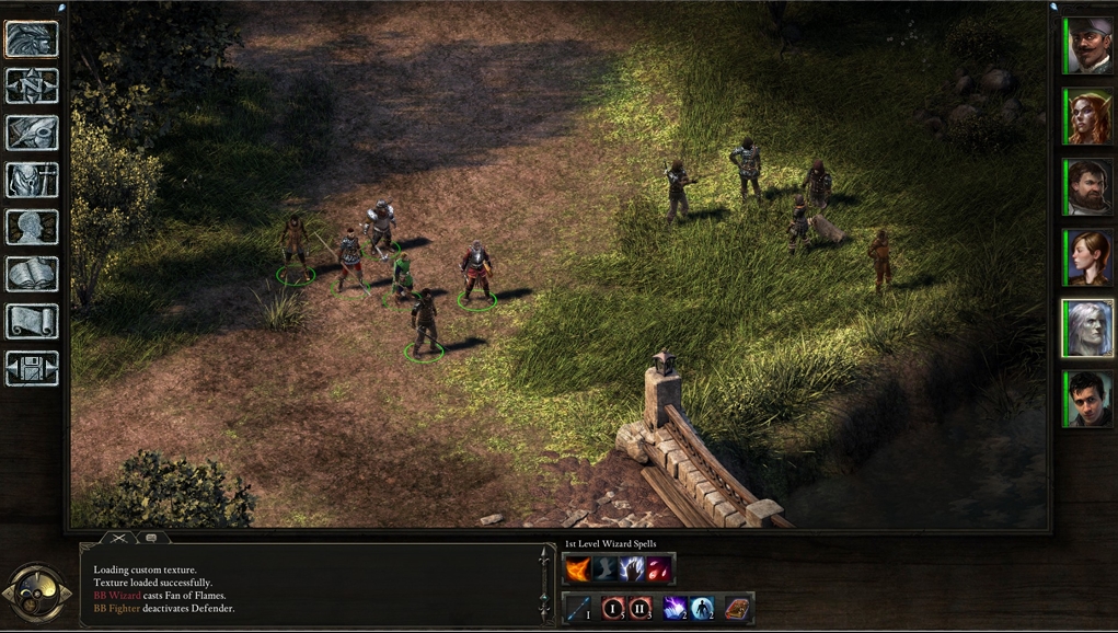
Right now the UI is like this:

ui-right-now.jpg


The 12 buttons on the left are what need to be redrawn. Raster, png. The exact dimensions are up to you.

The end result should be that a single button takes the entire line to itself and maybe slightly more vertical space as well. What you should aim for is something like this, except you'll have 12 buttons and not 8:

499921d485f3c19192f746165a80eb93.jpg


Also when the buttons are being hovered, they're being highlighted like this:
ui-highlight.jpg

Therefore each button should have a "highlighted" version as well.

Here's a template for you to try things on:

ui-template.jpg


If there's anything else I can provide, just ask.
 

Bester

⚰️☠️⚱️
Patron
Vatnik
Joined
Sep 28, 2014
Messages
11,108
Location
USSR
Just in case, the buttons as they are right now, stand for:

Attack, Formation
Cancel, Camp (aka rest)
Select All, Scouting (aka hide in shadows)
Inventory, Map
Character sheet, Stronghold
Journal, Options

Redrawing the circle for the Camp supplies is optional.
 

Zed

Codex Staff
Patron
Staff Member
Joined
Oct 21, 2002
Messages
17,068
Codex USB, 2014
They must be re-drawn? You don't like them?

Or is it just that you want them widened to fit the goal of having "one per line"?
 

Bester

⚰️☠️⚱️
Patron
Vatnik
Joined
Sep 28, 2014
Messages
11,108
Location
USSR
They must be re-drawn? You don't like them?

Or is it just that you want them widened to fit the goal of having "one per line"?

If they're not "one per line", then too much space is wasted and that's bad ui design. And in order for them to take up enough space, they have to be bigger. But the yellow icons are too small to be upscaled, and the background is too small and cannot be extended, and a frame would be just a nice addition I think, but it's really up to the artist.

So the only choice is to redraw them.
 

AwesomeButton

Proud owner of BG 3: Day of Swen's Tentacle
Patron
Joined
Nov 23, 2014
Messages
16,292
Location
At large
PC RPG Website of the Year, 2015 Make the Codex Great Again! Grab the Codex by the pussy Insert Title Here RPG Wokedex Divinity: Original Sin 2 A Beautifully Desolate Campaign Pillars of Eternity 2: Deadfire Steve gets a Kidney but I don't even get a tag. Pathfinder: Wrath
I'm interested too. Can we make them bigger and imitate the style of the buttons from Baldur's Gate for example?

Edit: I see that yes. I'll see what I can come up with that's not ripped off Baldur's Gate :)
 
Joined
Jul 11, 2010
Messages
3,213
Location
Vostroya
They must be re-drawn? You don't like them?

Or is it just that you want them widened to fit the goal of having "one per line"?

If they're not "one per line", then too much space is wasted and that's bad ui design. And in order for them to take up enough space, they have to be bigger. But the yellow icons are too small to be upscaled, and the background is too small and cannot be extended, and a frame would be just a nice addition I think, but it's really up to the artist.

So the only choice is to redraw them.
Err, then I probably didn't understand the request clearly. And here I started to work on more-or-less HD versions of BG series buttons with the general Idea that you'll substitute basic icons for BG ones. :negative:
So, to clarify, were we talking about buttons made in BG-style in dimensions and position, but using the PoE graphics for buttons, yeah?
 

Bester

⚰️☠️⚱️
Patron
Vatnik
Joined
Sep 28, 2014
Messages
11,108
Location
USSR
Stainless Veteran

>So, to clarify, were we talking about buttons made in BG-style in dimensions and position
Yes.

>but using the PoE graphics for buttons
No. You can draw BG style art for buttons or PoE style art, it's really up to you. I personally prefer BG style of course, because nostalgia.
 
Joined
Jul 11, 2010
Messages
3,213
Location
Vostroya
Bester
Alpha version of my buttons. I've made 12 BG-style buttons, mainly by redrawing BG ones.
Here's a mockup, sorry for bad kerning. Will tweak sizes and so on later. If my buttons are acceptable, then I'll add some texture (brushed metal will look good on them, if banal) and will make gold-colored versions for highlighted ones.
IZrYFqB.jpg


Here are buttons themselves:
y111lnw.png
LnVSFiz.png

1.Attack 2. Formation

tUrahaG.png
05nrFfi.png

3. Cancel 4.Camp (aka rest)

gYgcPpF.png
nrNBpKl.png

5. Select All 6. Scouting (aka hide in shadows)

t4GmvrF.png
lzsb4hV.png

7. Inventory 8. Map

0Mr3SjH.png
0kTxfPH.png

9. Character sheet 10. Stronghold

hVJEkWl.png
GMmBME9.png

11. Journal 12. Options
 

Bester

⚰️☠️⚱️
Patron
Vatnik
Joined
Sep 28, 2014
Messages
11,108
Location
USSR
Stainless Veteran Wow. They're great on their own, and if they were drawn for BG2, they'd be just great. There's a slight problem though and I guess I should've been more specific about it, and I kinda feel bad for making you go slightly into the wrong direction here by saying that "I liked bg2's style".

I don't know how much experience you've got with BG2 and PoE, so here's how the styles of the two games compare.
PoE's style is renaissance - very precise, thin, very articulate, very sharp. You can see that in the meticulous clock, you can see that in the log's corners. It uses dark gold colors. They have rifles in this game, hence renaissance I suppose.
BG2 - early christians style, byzantine style, sometimes even earlier. So it's crude, it's got fat lines, the material is very different too. Some icons in BG2 look like they could've been carved into stone by the stone age people - I'm talking about the rest icon and the character sheet icon (those two would have to go). In general, the details are vague, the icons more blurry.

Also, the background in BG2 is stone. In PoE it would be something more refined.

So I don't know if it's too late for those changes, but I hope it's not. :3
 

Bester

⚰️☠️⚱️
Patron
Vatnik
Joined
Sep 28, 2014
Messages
11,108
Location
USSR
I'm going through the newly externalized files and seeing some icons that may perhaps come in handy for you, I don't know.

CharacterCreation.png
 

AwesomeButton

Proud owner of BG 3: Day of Swen's Tentacle
Patron
Joined
Nov 23, 2014
Messages
16,292
Location
At large
PC RPG Website of the Year, 2015 Make the Codex Great Again! Grab the Codex by the pussy Insert Title Here RPG Wokedex Divinity: Original Sin 2 A Beautifully Desolate Campaign Pillars of Eternity 2: Deadfire Steve gets a Kidney but I don't even get a tag. Pathfinder: Wrath
PoE's style is renaissance - very precise, thin, very articulate, very sharp. You can see that in the meticulous clock, you can see that in the log's corners. It uses dark gold colors. They have rifles in this game, hence renaissance I suppose.

Not to lecture you, but:
1. PoE is set in a mostly wild and underdeveloped area of the world, hence the overall wooden/stone and "less-than-precise" skeuomorphic style of the whole UI. In fact, the shiny yellow buttons with hover effects lacking volume were something I thought from the beginning doesn't tie in with the rest of the UI design.
2. "Renaissance" art style isn't associated with the things you list. Its most prominent feature is that it imitates the style of Classical antiquity.
3. It's arquebuses, not rifles, there is a big difference :)
 
Joined
Jul 11, 2010
Messages
3,213
Location
Vostroya
Stainless Veteran Wow. They're great on their own, and if they were drawn for BG2, they'd be just great. There's a slight problem though and I guess I should've been more specific about it, and I kinda feel bad for making you go slightly into the wrong direction here by saying that "I liked bg2's style".

I don't know how much experience you've got with BG2 and PoE, so here's how the styles of the two games compare.
PoE's style is renaissance - very precise, thin, very articulate, very sharp. You can see that in the meticulous clock, you can see that in the log's corners. It uses dark gold colors. They have rifles in this game, hence renaissance I suppose.
BG2 - early christians style, byzantine style, sometimes even earlier. So it's crude, it's got fat lines, the material is very different too. Some icons in BG2 look like they could've been carved into stone by the stone age people - I'm talking about the rest icon and the character sheet icon (those two would have to go). In general, the details are vague, the icons more blurry.

Also, the background in BG2 is stone. In PoE it would be something more refined.

So I don't know if it's too late for those changes, but I hope it's not. :3
Well... Here goes a week's work, I guess. :negative:

Oh well. On the plus side, I have my *,psds from BG-style buttons which you canned, so the new variant took only this holiday.
Here's Buttons project alpha v2, probably my last, sadly. I can tweak this variant, but I'm a russian poorfag, I barely have free time from frantically working for potatoes, so another total redesign is (for the time being) out of the question.
rHBCNC1.jpg


Mvb4apc.png
iO2eTKN.png

1.Attack 2. Formation

mo1Nwtz.png
fB68MTe.png

3. Cancel 4.Camp (aka rest)

5c1J1is.png
fdpyH46.png

5. Select All 6. Scouting (aka hide in shadows)

JHJ0CCo.png
YEFr4R3.png

7. Inventory 8. Map

MDzRdlX.png
MyUZwle.png

9. Character sheet 10. Stronghold

AoxAw4H.png
XZMZNQo.png

11. Journal 12. Options

Changelog
Made a border using one from your post with PoE images as a guideline. Used PoE's "Pale Gold" color wherever possible.
Made a new background texture for buttons, dark lilac-deep blue wood, it turned out a little too bright, will tweak later.
Made new pictures for Camp, Charsheet and Stronghold buttons.
Tweaked previous images so they would fit gold scheme, fixed various miscellaneous errors.
New buttons are 90px wide, and not 96 like previous ones, so they'd fit better.
Kerning on the mockup is still not right, but oh well, I don't even know whether they'll work.
 

J_C

One Bit Studio
Patron
Developer
Joined
Dec 28, 2010
Messages
16,947
Location
Pannonia
Project: Eternity Wasteland 2 Shadorwun: Hong Kong Divinity: Original Sin 2 Steve gets a Kidney but I don't even get a tag. Pathfinder: Wrath
I like it very much. My only remark is that the blueish background of the icons are really off compared to the brown texture of the HUD. But the same can be said about the background of the skill/spell icons on the middle right.

Edit: oh, any maybe you could space it out the icons a little, just like with the BG2 style icons above. So they take up the whole left column.
 
Joined
Jul 11, 2010
Messages
3,213
Location
Vostroya
I like it very much. My only caviat is that the blueish background of the icons are really off compared to the brown texture of the HUD. But the same can be said about the background of the skill/spell icons on the middle right.
Yeah, the texture turned out too bright and saturated, but I don't even know if Bester would use them, so I haven't tweaked it yet. I probably would have changed it to dark lilac-grey or something like that, purple and lilac (and dark blue) are opposite colors of yellow (including pale gold), so the buttons' pictures are more easily discernible on such backgrounds.
 

Ellef

Deplorable
Joined
Dec 29, 2014
Messages
3,506
Location
Shitposter's Island
PC RPG Website of the Year, 2015
I like it very much. My only remark is that the blueish background of the icons are really off compared to the brown texture of the HUD. But the same can be said about the background of the skill/spell icons on the middle right.

Edit: oh, any maybe you could space it out the icons a little, just like with the BG2 style icons above. So they take up the whole left column.

I'd actually have all the icons together and the rest icon on its own down the bottom with a bit of a gap.
 
Joined
Jul 11, 2010
Messages
3,213
Location
Vostroya
Buttons project - beta v1
MppcEMp.jpg


Changleog
Changed texture to something both wooden and more in line with general interface. Recolored it.
Slightly changed PoE-style golden border.
Added new icons for Scouting, Inventory and Journal.
Many other tweaks.
 

felipepepe

Codex's Heretic
Patron
Joined
Feb 2, 2007
Messages
17,278
Location
Terra da Garoa
I know I'm late here, but I find it confusing and non-intuitive to have menu buttons (inventory, character, option, etc) mixed together with action buttons (attack, formation, select all, etc).

Wouldn't it be better to move the actions to between the combat log and the spells?
 
Last edited:

AwesomeButton

Proud owner of BG 3: Day of Swen's Tentacle
Patron
Joined
Nov 23, 2014
Messages
16,292
Location
At large
PC RPG Website of the Year, 2015 Make the Codex Great Again! Grab the Codex by the pussy Insert Title Here RPG Wokedex Divinity: Original Sin 2 A Beautifully Desolate Campaign Pillars of Eternity 2: Deadfire Steve gets a Kidney but I don't even get a tag. Pathfinder: Wrath
I threw something together for around half-hour, starting off with Bester's template and using material from the guidebook's cover page. It's a work in progress, so don't judge too harshly. I'm thinking of doing at least a couple of versions of HUD textures, one with some sort of mosaic, one that resembles BGII, and one with adra stones as the main background. I also have some sketches of button icons which I'll scan and run through Photoshop to add color to them. Their style is in line with PoE's but still somewhat original I think. I'm curious about what your reactions will be.

1rP5f7b.jpg
 

felipepepe

Codex's Heretic
Patron
Joined
Feb 2, 2007
Messages
17,278
Location
Terra da Garoa
Lazy as hell PS, but I think it works well:

8rK0CRA.jpg


The problem now is that the left column is quite empty... but at least you have six icons on both sides!
 
Last edited:

AwesomeButton

Proud owner of BG 3: Day of Swen's Tentacle
Patron
Joined
Nov 23, 2014
Messages
16,292
Location
At large
PC RPG Website of the Year, 2015 Make the Codex Great Again! Grab the Codex by the pussy Insert Title Here RPG Wokedex Divinity: Original Sin 2 A Beautifully Desolate Campaign Pillars of Eternity 2: Deadfire Steve gets a Kidney but I don't even get a tag. Pathfinder: Wrath
I agree with what you said about the action buttons being separate from the interfaces' buttons. My buttons will be wider than they are tall though, IE games' style.
 

As an Amazon Associate, rpgcodex.net earns from qualifying purchases.
Back
Top Bottom